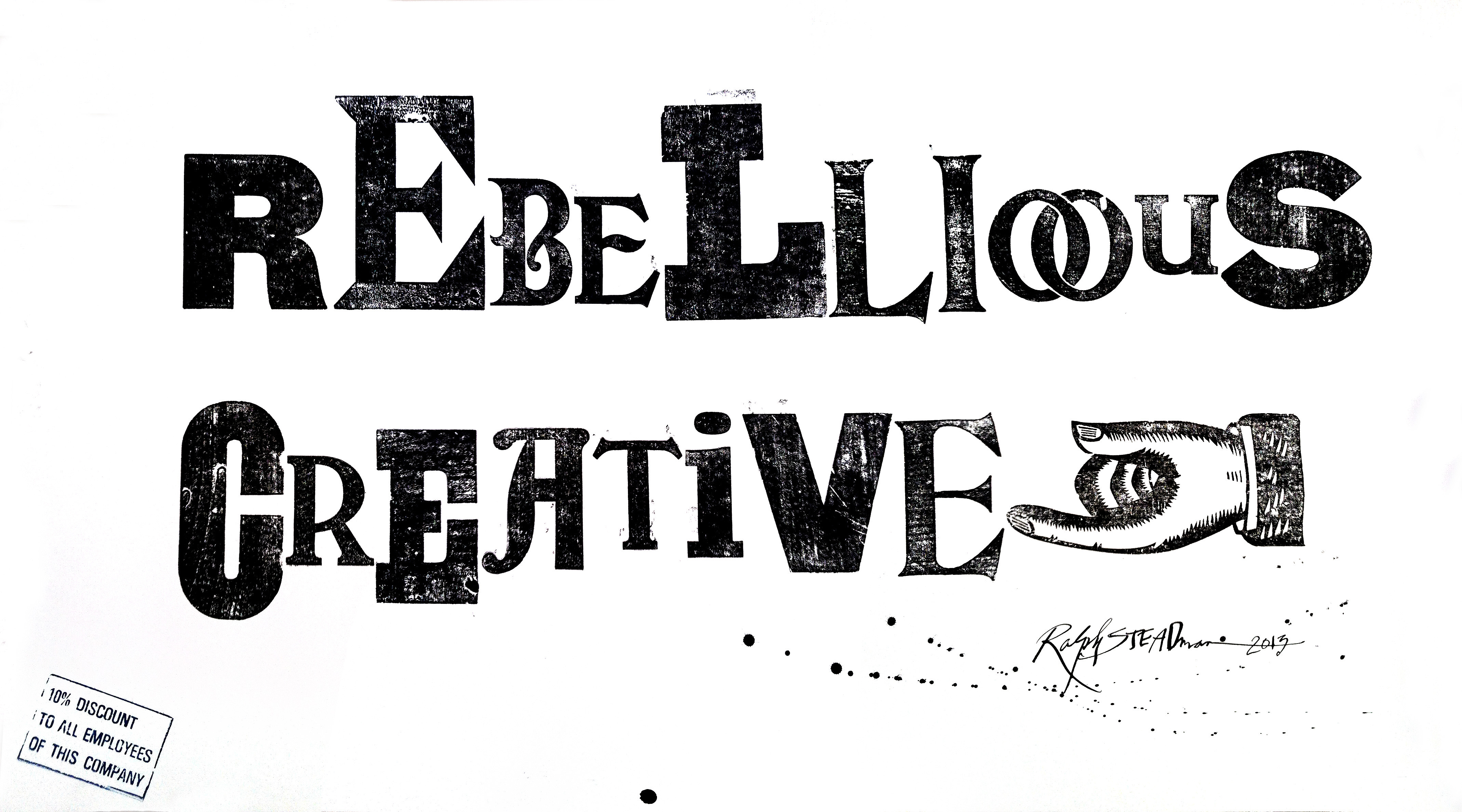
‘Couture’ by Stephen Boss
“I decided to use process as my playground. My wife is a milliner, so I had fine woolens, clasps and closures at my fingertips. I opted to begin with my geometric typeface Embauhaus as the undergarment, then I cut out a few letterforms to create a “pattern.” Sticking to my process plan, I allowed the pins to remain, like a haute couture garment in the works. After cutting out the select letters, I then added the ‘construction’ elements such as measuring tape, the clasp, additional pins and spool of thread.”