Category Archives: Press

Gothic type in fashion, New York Times

Screen Shot 2016-08-10 at 13.08.02

Vetements, Brioni and Kanye Agree: It’s Gothic Time
New York Times, August 9th
By Max Berlinger

“It’s been used for some of the most sacred texts in the Western world,” said Michael Bierut, a partner at the design firm Pentagram and a senior critic at the Yale School of Art. “At the same time, it’s used by biker gangs, street gangs, heavy-metal groups and death-metal groups. It seems like Satan has come to own it more than God.”

Continue reading

AIGA ‘How Type Can Tell the History of Your City’

AIGA Eye on Design

How Type Can Tell the History of Your City
A London designer leads a tour of her neighborhood signage
By Ellen Himelfarb for AIGA’s Eye on Design.

**BOOK HERE for the final two Dalston Type Safaris taking place this year**

“On a recent Tuesday evening, I followed Sarah Hyndman around Dalston, one of London’s most creative and fast-gentrifying neighborhoods. Her so-called Dalston Type Safari hadn’t sounded like the most exotic endeavor, to this local, at least. It resembled a safari insofar as we roamed among native creatures, some growling to themselves, and kept alert for dangerous beasts of the wheeled variety.

“Yet Hyndman, author of Why Fonts Matter and an expert on the psychology of typefaces, came armed with vast amounts of wisdom (and a tote stuffed with gummy treats, popcorn, and hand-pressed postcards, lending it all a staycation vibe). I think we all came away as enlightened as if we’d been abroad and back.”

Read the full article…

aiga logo

Jellybeans and ‘Experimental’

Q&A at Letterform Live

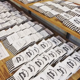
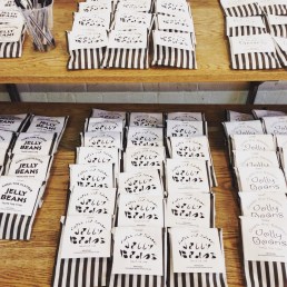
The theme of Grafik’s Letterform Live this week was ‘Experimental’, and it was an exciting evening to be a part of. My aim for the evening was to bring a bit of ‘bonkers and magic’ at a time of so much anxiety. We filled the bar with jellybeans and asked the 130 audience members to guess each flavour from the style of the typeface on the label. If you weren’t at the event you can still take part in this experiment here.

Jelly beans at Letterform Live Jelly beans at Letterform Live

I spoke about how amazing the human brain is for the skilful way it creates a ‘sub-programme’ to perform the complex task of reading, which your subconscious performs automatically. Your eyes simply glance over a series of marks in a huge array of shapes and sizes and—as if by magic—stories, ideas, memories, songs, smells are conjured up right there in your mind.

Continue reading

Tasting Type Like Wine, Extensis

extensis 1 extensis 2

In celebration of the official launch of Why Fonts Matter in the US today: Being interviewed by Extensis gave me the opportunity to explain why I set up Type Tasting back in 2013. “We spoke with Sarah about her work as a researcher and graphic designer, how she’s able to predict how you take your coffee, and more.”

Extensis
Tasting Type Like Wine: An Interview with TypeTasting’s Sarah Hyndman


Multiple Choice, Grafik

Grafik Grafik

In celebration of the official launch of Why Fonts Matter in the US today: Grafik asked how I chose the typfaces for Why Fonts Matter. “Choosing fonts for a book called Why Fonts Matter is always going to be tricky.”
(Please note, the competition date has passed).

Grafik
Multiple Choice

grafik logo


A taste of type, Creative Review

Creative Review Creative Review

In celebration of the official launch of Why Fonts Matter in the US today: Creative Review ran a piece on the pop-up Type Tasting at the V&A for the London Design Festival. “Type Tasting’s series of multisensory experiments, for me, turned typography on its head.” Natalie Kelter

Creative Review
A taste of type, Natalie Kelter

creative review logo 2up 300

(Photos David Owens)


Font of inspiration: London’s lettering, Financial Times

Financial Times Financial Times

In celebration of the official launch of Why Fonts Matter in the US today: The Financial Times reported on London’s lettering, giving Dalston Type Safaris a good mention. “Graphic designer Sarah Hyndman is on a mission to make typography more appealing.”

Financial Times
Font of inspiration: London’s lettering
By Rob Alderson

FT-Logo


Type on the tongue, Eye

eye 1Eye Eye

In celebration of the official launch of Why Fonts Matter in the US today: Eye’s panel checked out the taste of Helvetica, Impact and Comic Sans (as cooked up by Sarah Hyndman). “Perfect. Helvetica is too serious to be sweet.” “Tastes more like Akzidenz Grotesk”, “Comic Sans deserves better”

Eye
Type on the tongue

Eye logo


Why Fonts Matter, and how they impact your mood, It’s Nice That

Mood

In celebration of the official launch of Why Fonts Matter in the US today: This post about fonts and mood became the most popular post on It’s Nice That in the first three months of 2016. “The one womantour-de-force behind Type Tasting … looks at the power typography has over our lives and senses.”

It’s Nice That
Why Fonts Matter, and how they impact your mood

itsnicethat_logo


If You Love That Font So Much, Why Don’t You Date It? Wired

Wired

In celebration of the official launch of Why Fonts Matter in the US today: Liz Stinson from Wired played the Type Dating Game via Skype. “20 percent of women said they’d pick Franklin Gothic as their typographic beau, the winner by a landslide. I know it sounds weird.”

Wired
If You Love That Font So Much, Why Don’t You Date It?
By Liz Stinson

wired logo LR