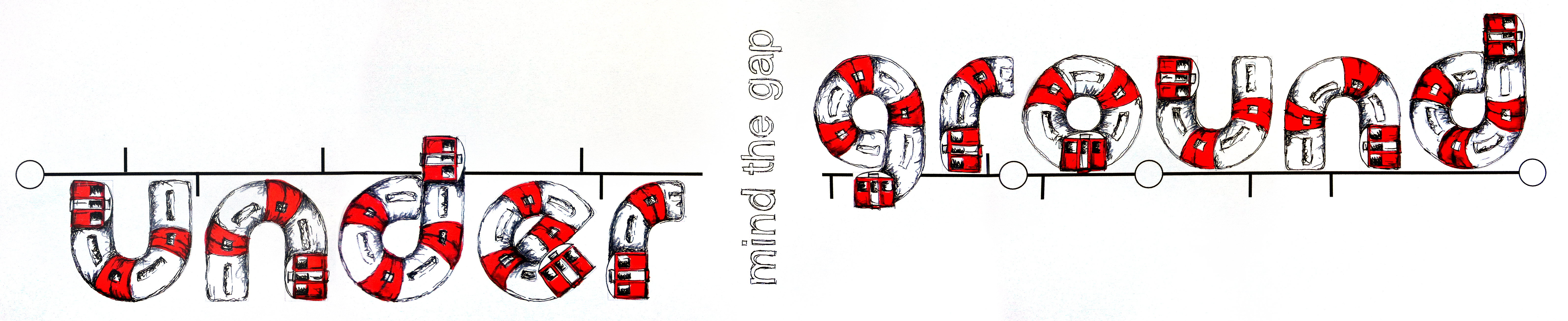
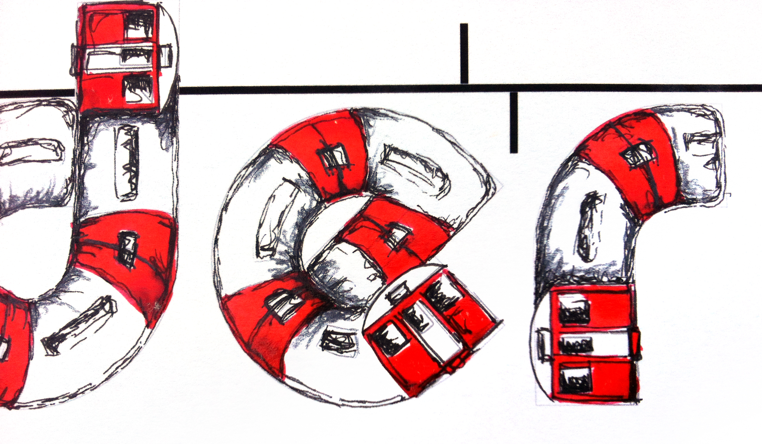
#LDF13: ‘Underground’ by Maria Cox
Maria Cox chose the word ‘Underground’ because she has an ongoing fascination with this London icon. For her Type Tasting piece she initially looked at fonts with a curve to them and thought about drawing a train running on railway tracks to create the typeface. She came up with the final idea after sketching thumbnails with different ideas of trains and tracks, and playing with the meaning of the word so that part of the word appeared below ground level.
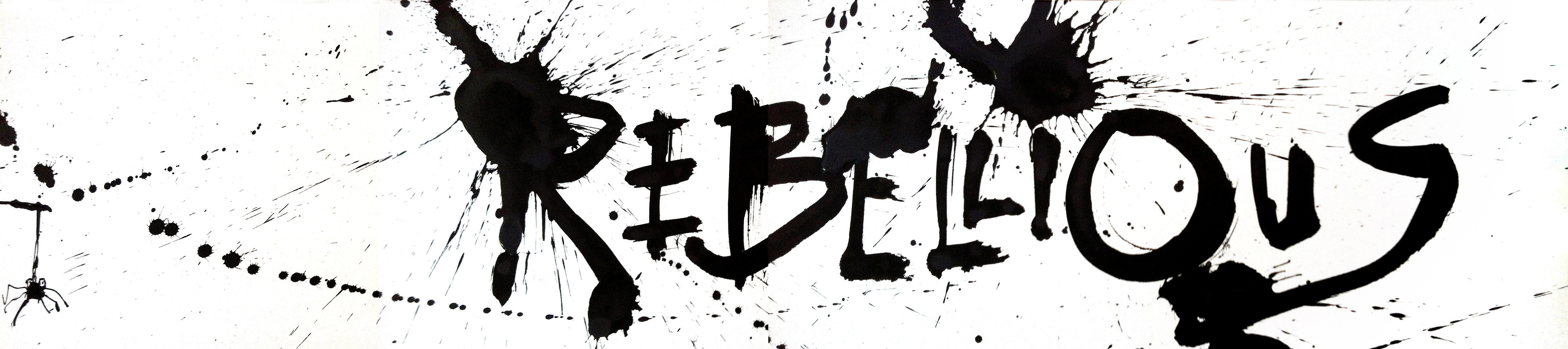
An accident involving a colleague and some spilt ink led to an unscheduled delay (well it is the underground), but we really like the resulting Hitchcockian blood red ink splattered over the ‘Mind the Gap’ warning.