#LDF13: ‘Clean’ by Nick Watts
“Watching British riders winning at the highest levels of pro cycling is now as familiar to Londoners as the sight of the mucky ‘chain print’ marks on the calves of its commuters and couriers. Hordes of greasy, oily ride-to-work schemers and Boris Bikers have taken to the roads, inspired by the cleanest riders in the sport for generations.”


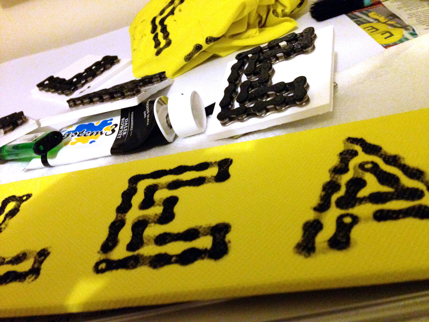
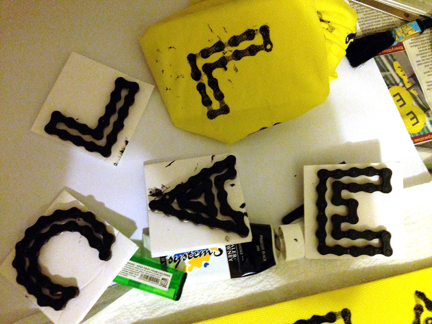
Watts created his letters from sections of bike chain which he mounted onto backings to create printing blocks. The letters are printed in acrylic paints on yellow nylon fabric.


Watts is a keen cyclist who, as well as his cycling typography, recently created a Tour de France Infographics project to celebrate the 100th Tour de France.

‘Clean’ by Nick Watts is one of the words that will be displayed at Type Tasting with the London Design Festival 2013 at the V&A.
Display: 14 – 19 September 2013
Drop in workshops: 10am – 5pm, 14 & 15 September 2013
London Design Festival Hub
Design Studio, Sackler Centre
V&A
Cromwell Road
London SW7 2RL
Type Tasting workshops and type safaris. Typography training with a creative twist.
