Tag Archives: By Sarah Hyndman

‘Connected’ by Becky Chilcott and Sarah Chilcott

process 2‘Connected’ by Becky Chilcott and Sarah Chilcott

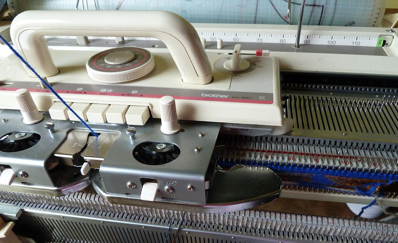
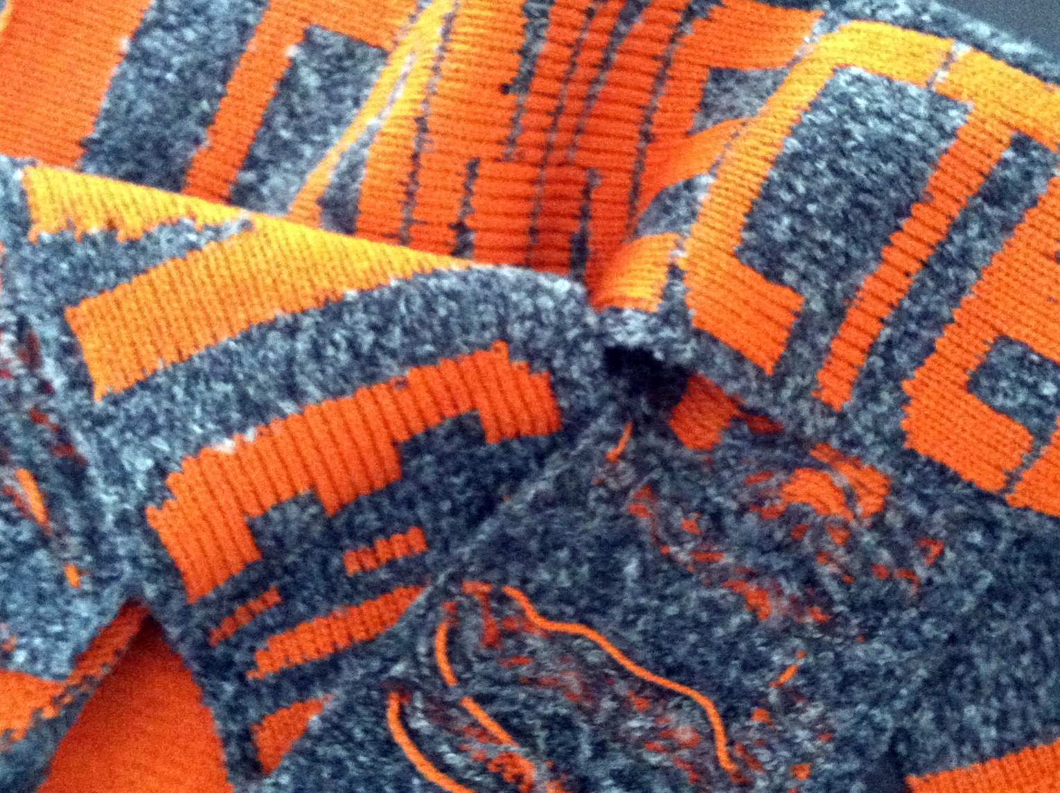
“Growing up with a Mum who is constantly knitting, I developed an aversion to having a go myself early on. When you’re a teenager who likes their sleep, it’s not the best sound to wake up to at 7.30am every Saturday morning… she doesn’t use quiet knitting needles as you’d imagine but a knitting machine that is around 1 metre long and is blooming noisy (although I was always attired in custom knits that were often made on demand).”

CarriageandBed

‘Sexy’ by Mind Design

05_sexy_wip

‘Sexy’ by Mind Design

Holger Jacobs runs Mind Design with Stewart Walker. Jacobs explains that “We Londoners are usually considered a bit stiff and there is a famous saying: ‘No sex please – we are British’.

“However, we were interested in the swinging 60s when London became sexy. Our typographic treatment of the word is inspired by the soft, psychedelic, lava lamp-like lettering seen during the hippie era. Like a big hugging blow up cushion.”

01_sexy_wip

Continue reading

#LDF13 ‘Expressive’ by Ruth Rowland

RuthRowland3_SH

#LDF13 ‘Expressive’ by Ruth Rowland

Ruth Rowland is a lettering artist who specialises in calligraphy, expressive typography and hand drawn ink on paper. We are delighted that she’ll be joining us for the drop in workshops at the V&A. Rowland explains her approach to her word ‘Expressive’…

Expressive Ruth Rowland

Continue reading

#LDF13 ‘Multitudinal’ by Hedy Parry-Davies

hedy detail 4hedy detail 1

Multitudinal Hedy Parry Davies lr

Multitudinal by Hedy Parry-Davies

Parry-Davies’ piece for Type Tasting explores the ways we experience the River Thames through a combination of the maps we use to navigate our way around the city—via the Underground, cycling, walking and driving. The different maps show the overview of the city both present and past, and also link us to the personal experience of existing within it. “Maps express a wide range and detail of information efficiently and in a form which I find beautiful. My tessellated origami enabled me to inter-weave all these elements to create an artwork.”

Continue reading

#LDF13 ‘Exotic’ by Lizzie Hobbs

Exotic-Lizzie HobbsExotic-Lizzie Hobbs2

#LDF13 ‘Exotic’ by Lizzie Hobbs

Hobbs has designed the word ‘Exotic’ “to reflect some of the cultures which are thriving in London. Each letter has been designed to reflect the script from these cultural languages and then filled in with patterns—Islamic, Middle Eastern and South Asian. The piece has been drawn freehand. ‘E’, ‘O’ and ‘I’ reflect Persian, Urdu and Arabic. ‘X’, ‘T’ and ‘C’ reflect Bengali, Tamil and Hindi.”

Continue reading

Blog: Typographic explosion

words on floor 05

Blog: Typographic explosion

The Type Tasting studio is full of creative typography as we begin to photograph, select and curate the final display for Type Tasting with the London Design Festival. It’s an exciting collection in such a range of styles and mediums, what connects all the pieces is the amount of thought and hands on creativity that’s gone into them.

Continue reading

#LDF13 ‘Disenchanted’ by Siro

siro disenchanted sq2

#LDF13 ‘Disenchanted’ by Siro Carraro

Artist Siro Carraro grew up in Italy, studied art in London and works from his sunny North London studio which is an Aladdin’s Cave of large canvasses and colour. He describes himself as “A creator of dreams and a collector of images, that run freely from my mind in and out of my canvases.”

Continue reading

#LDF13 ‘Ornithological’ by Claire Scully

 ornithological claire scully SQ

#LDF13 ‘Ornithological’ by Claire Scully

Scully’s meticulously hand drawn feathers display the level of intricate detail to be found in much her work including her typeface designs. ‘Ornithological’ was drawn late into the night after returning from a trip to the US to avoid dealing with jetlag.

The inspiration for Scully’s self initiated work often comes from my everyday surroundings of the metropolis and its relationship with the natural world. “I love 50’s, 60’s and 70’s architecture particularly tower blocks with their form and location, this is where I also find the connection to nature and natural patterns in the environment of interest.”

Continue reading

#LDF13 ‘Productive’ by Pat Randle

Productive Pat Randle

productive process 02

#LDF13 ‘Productive’ by Pat Randle of Nomad Letterpress

Letterpress printer Randle has chosen Caslon* to represent London, using 96-point Caslon Italic showing swash alternatives drawn by an Americam designer called T. M. Cleland in the 1930’s for (ATF) American Type Foundries. The CT ligature is printed from a laser cut letter.

Continue reading