

#LDF13 ‘Productive’ by Pat Randle of Nomad Letterpress
Letterpress printer Randle has chosen Caslon* to represent London, using 96-point Caslon Italic showing swash alternatives drawn by an Americam designer called T. M. Cleland in the 1930’s for (ATF) American Type Foundries. The CT ligature is printed from a laser cut letter.

*Caslon was originally cut by William Caslon, the first British type founder, in his London-based foundry which Spitalfield’s Life recently published a wonderful set of photos of. This was in the eighteenth century, a time when the printing industry was becoming well established. Caslon’s typefaces were distributed throughout the British Empire and became the ubiquitous style of the day, appearing in many famous historical documents.
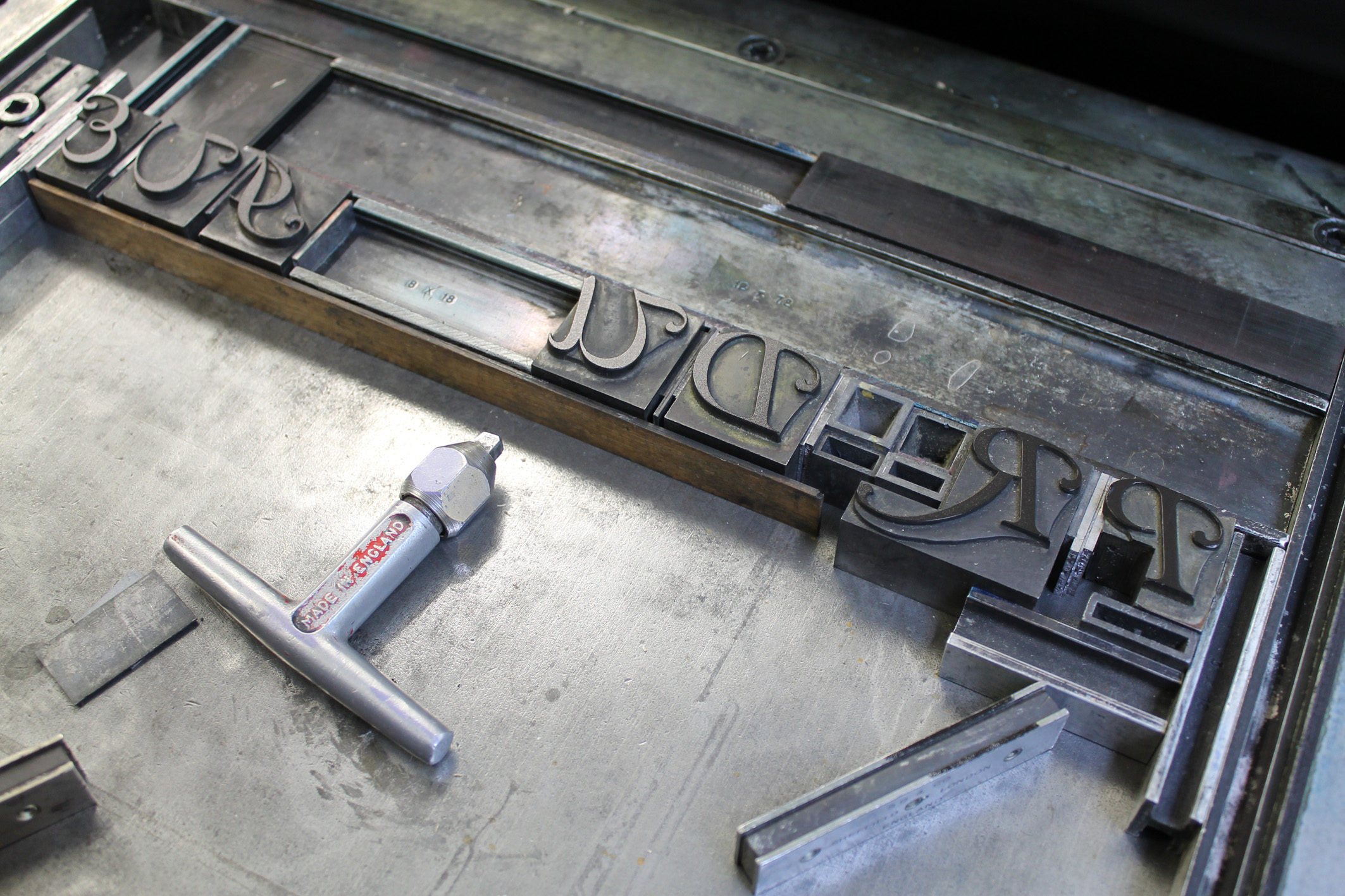

Pat Randle runs Nomad Letterpress from the Whittington Press who have, since 1971, been printing and publishing books from metal type (‘as God intended’, the Revd Bernard Roberts once remarked) in the Gloucestershire village of Whittington. We are one of the very few letterpress printers anywhere to cast our own type, a technology that has all but disappeared with the advent of computer setting. Like many others, we believe that Gutenberg’s technology will never be equalled for the purity of its typefaces, its crispness of impression, and for that elusive third dimension entirely lacking from computer-derived printing. Read his blog or follow him on Twitter @NomadLetterpres
‘Productive’ by Pat Randle is one of the words that will be displayed at Type Tasting with the London Design Festival 2013 at the V&A.
Display: 14 – 19 September 2013
Drop in workshops: 10am – 5pm, 14 & 15 September 2013
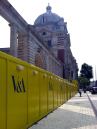
London Design Festival Hub
Design Studio, Sackler Centre
V&A
Cromwell Road
London SW7 2RL
Type Tasting workshops and type safaris. Typography training with a creative twist.
