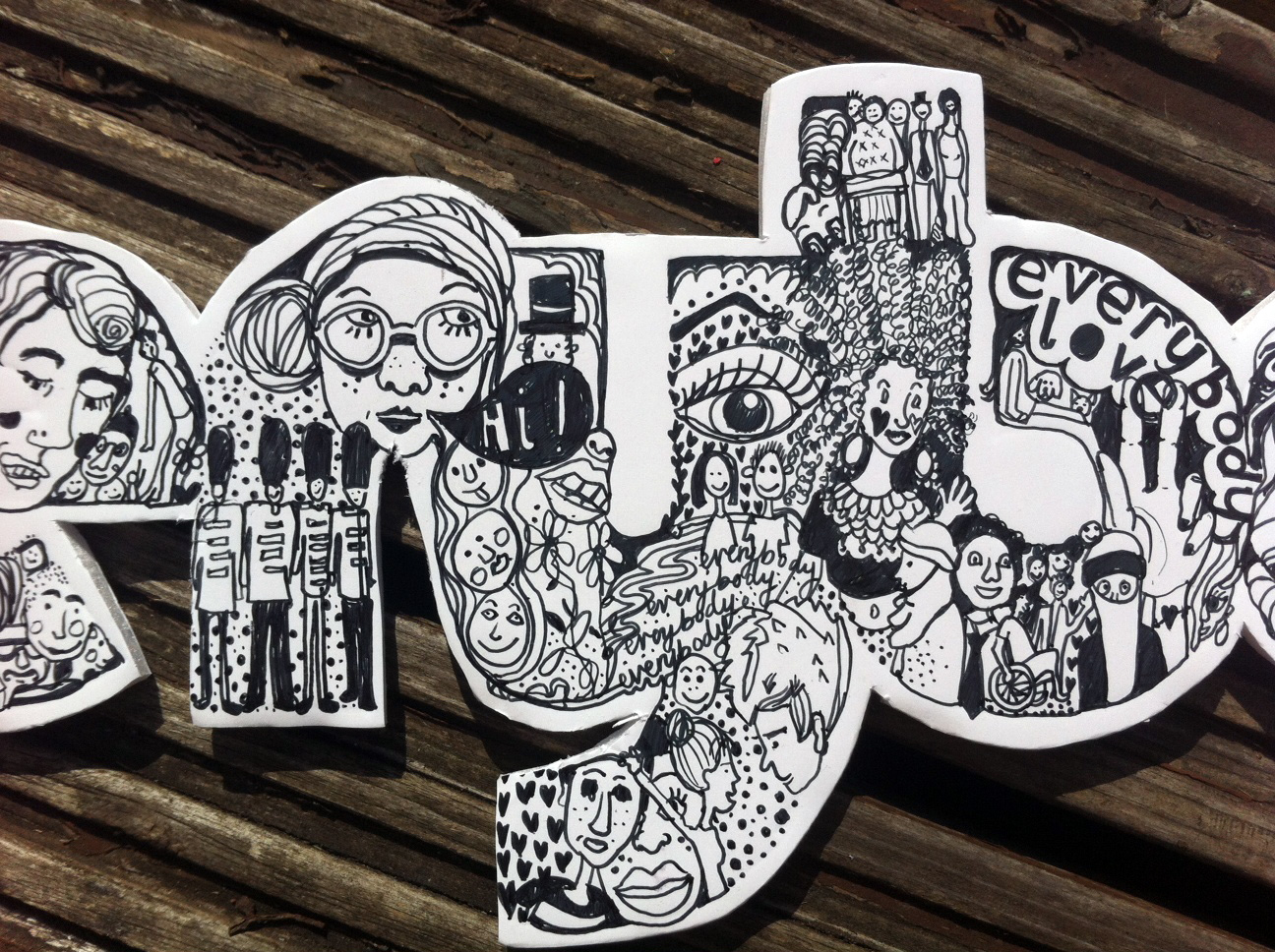
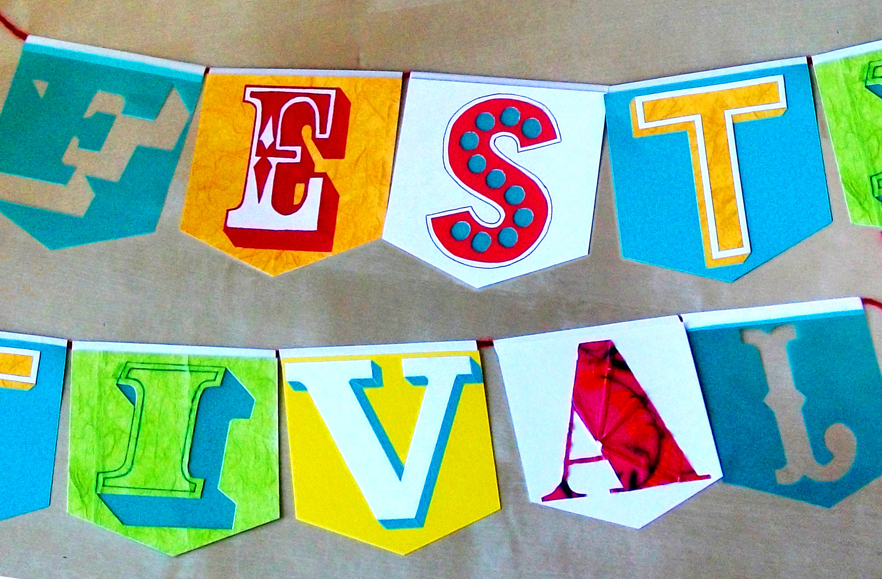
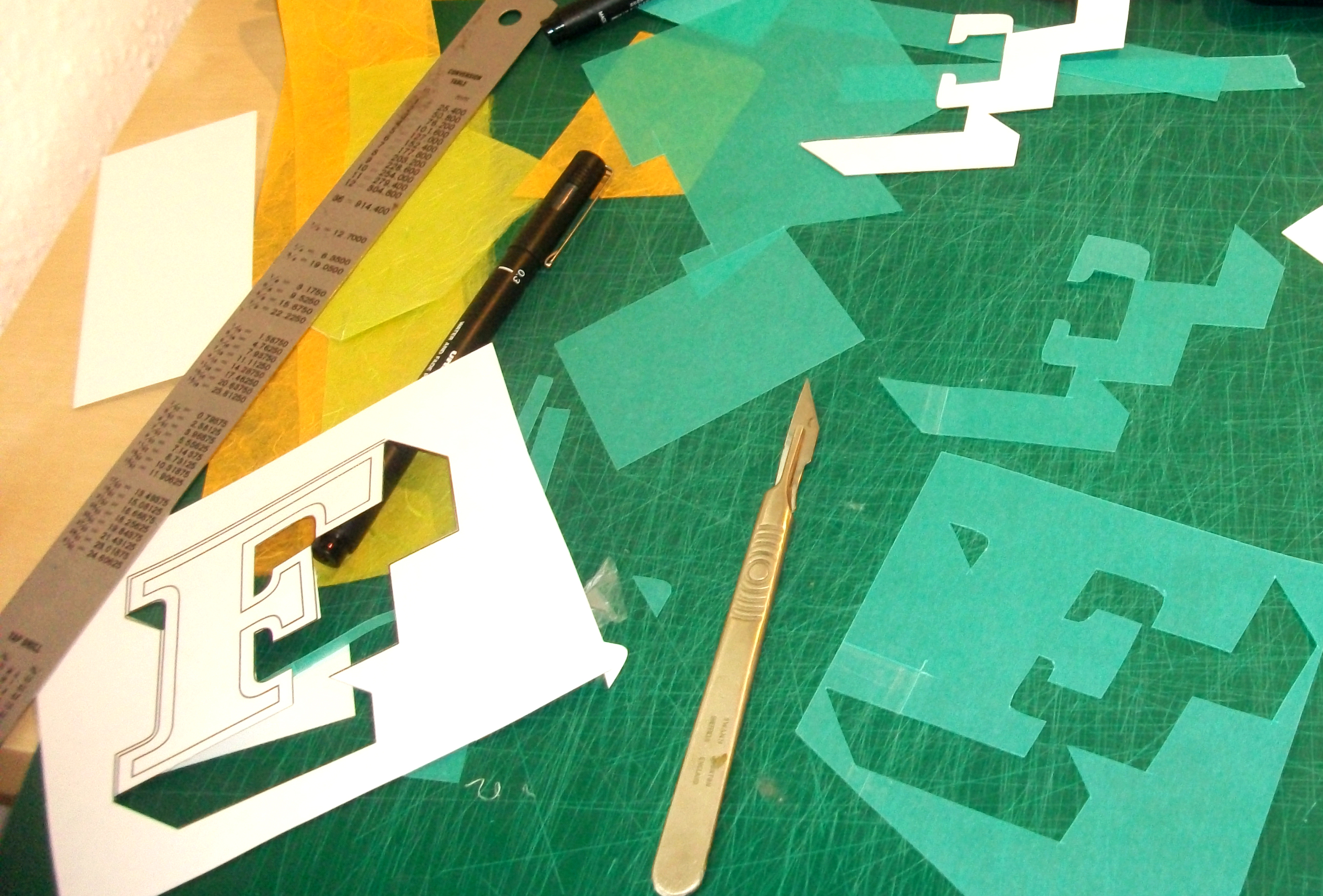
‘Temporary’ by Anthony Peters
“Many of the words picked by contributing artists for this project are celebratory, my first word is quite the opposite, A reflection on the homeless ‘culture’ and the existence of the homeless beneath the noses of the daily grind. Everything is temporary when you get moved on, when you nomadically source food, shelter and friendship. The material (cardboard) reflects a material used as shelter and as a ‘padding’ to buffer the hard cold concrete beds which many people sleep on in the city that never sleeps. Cardboard itself is temporary, ideally this piece of typography would be exhibited in a city doorway, to be poached and weathered until it is no more.”

Continue reading →