We had letterpress prints by Typography Emporium guest Zoë Chan of Typelark in the Type Tasting studio at the weekend. Zoë prints on a vintage Adana letterpress and experiments with print techniques such as printing in reverse to create unusual textures.
Continue reading
Tag Archives: zoë chan
‘Imagined’ and ‘Spooky’
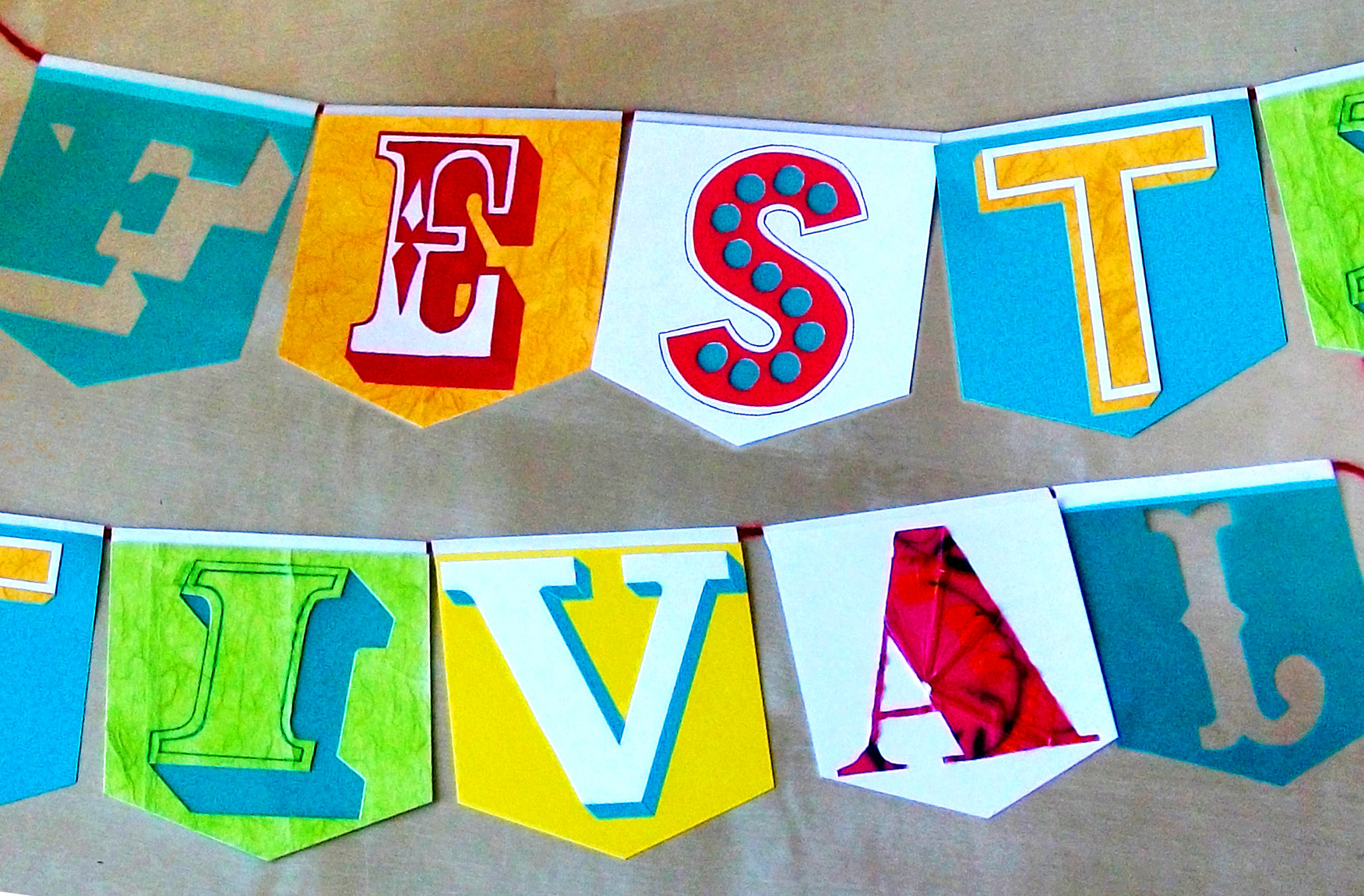
‘Festival’ by Zoë Chan
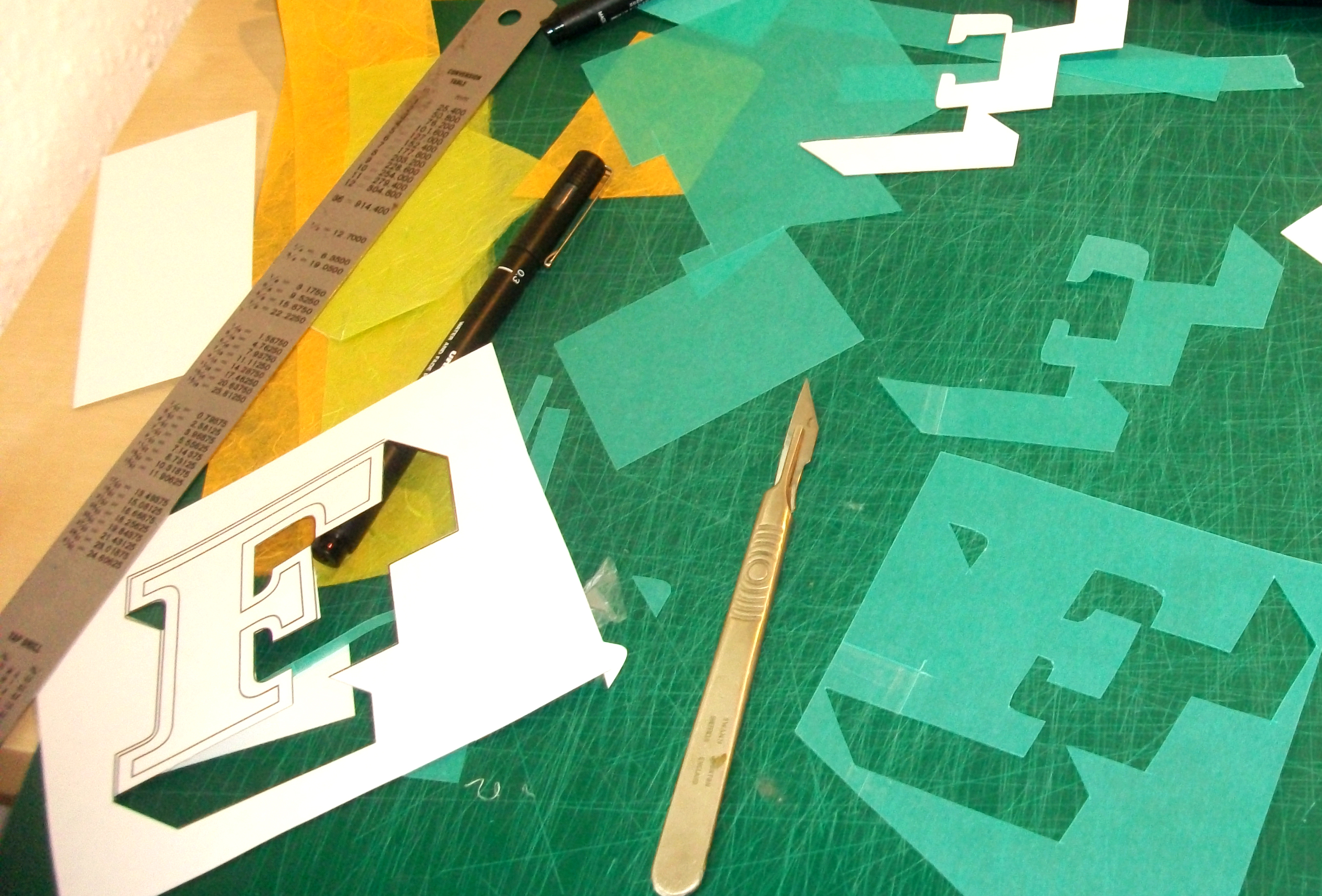
“My main inspiration for ‘Festival’ is my love of vintage signage and type, especially that which typifies ‘Britishness’ and has been used in various street and building signs around London over the 19th-mid 20th Century. My passion is type in the environment / spatial type, and aside from the typefaces used being taken from signage I chose to display it as bunting; this both embodies the idea of festival and celebration and it can be hung in any environment, both inside and outside. My colours and materials used signify the excitement, eclecticism and cacophony of sights, sounds and emotions found around London.”
#LDF13: Summer in the city
Two beautifully summery submissions for Type Tasting with the London Design Festival at the V&A. ‘Festival’ is by graphic designer Zoë Chan, the typographic bunting is created from felt and paper with lots of chunky display type. Dubai based Monica Brough’s ‘Botanical’ is inspired by her love of the natural world and all the gardens and parks in and around London such as Hampton Court and Kew Gardens.