‘Design’ by Martin Cahill
“I wanted represent the whole design scene in London, from iconic figures such as Neville Brody and Vivienne Westwood to creative agencies such as Pentagram and NB Studio and to the individuals and students striving to make their mark on the London design landscape.”
“I didn’t want to follow the obvious clichés or to merely reproduce famous objects of design with my word. Instead, I decided that the best approach was to evoke through the form of my letters what I consider the core principles of London design – creativity, innovation, intelligence, colour and energy.”

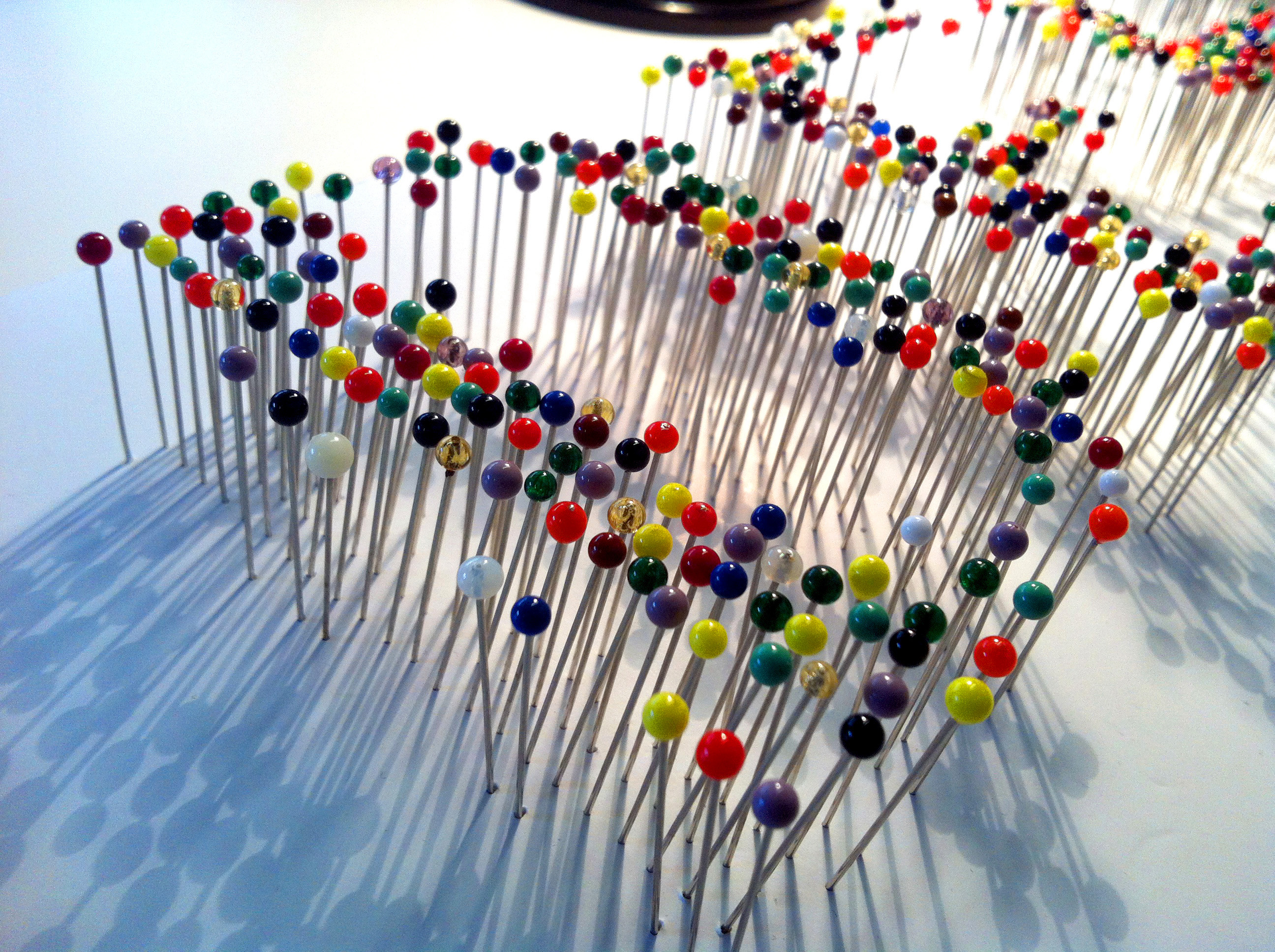
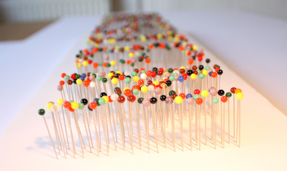
“Saying that, Harry Beck’s iconic tube map was the starting point for my concept and tube stops were the inspiration for using coloured pin heads. I decided not to restrict myself to the colours of the tube map as I wanted a palette that reflected the multiculturalism and diversity of the London design scene.”
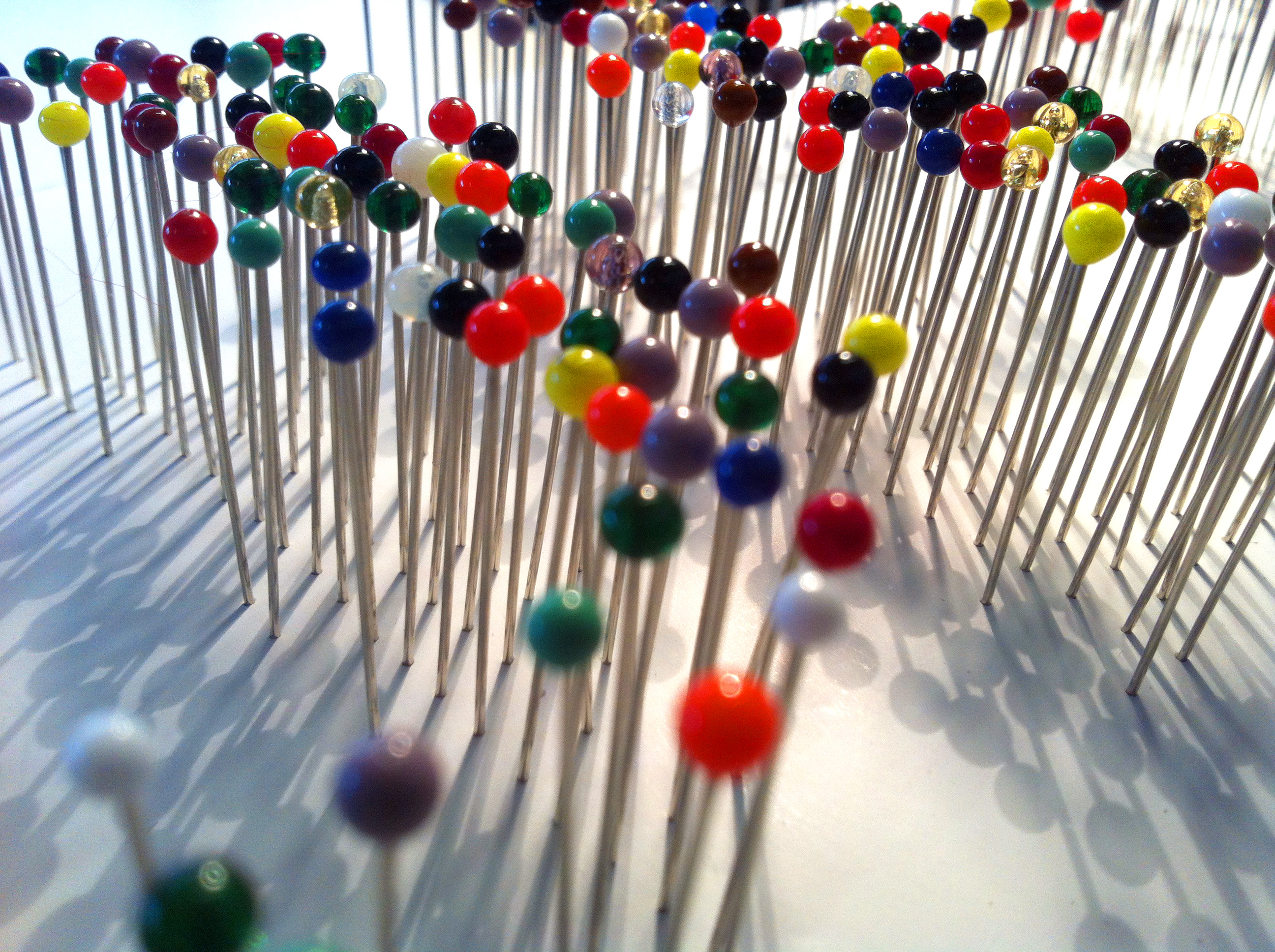
“The process of producing my concept involved placing the glass fashion pin heads in a modular pattern reminiscent of Alan Fletcher’s famous Reuters logo from 1965 and Damian Hirst’s spot paintings, in the form of the letters. I then removed pins from the edges of the letters to create a more informal shape, which in my mind represent the constantly evolving, always challenging London design scene.”
Photographs by Sarah Hyndman and Qian Yuan.

‘Design’ by Martin Cahill will be displayed at Type Tasting with the London Design Festival 2013 at the V&A.
Display: 14 – 19 September 2013
Drop in workshops: 10am – 5pm, 14 & 15 September 2013
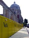
London Design Festival Hub
Design Studio, Sackler Centre
V&A
Cromwell Road
London SW7 2RL
Type Tasting workshops and type safaris. Typography training with a creative twist.
