Type Tasting at SXSW, Austin, Texas
Saturday March 8th
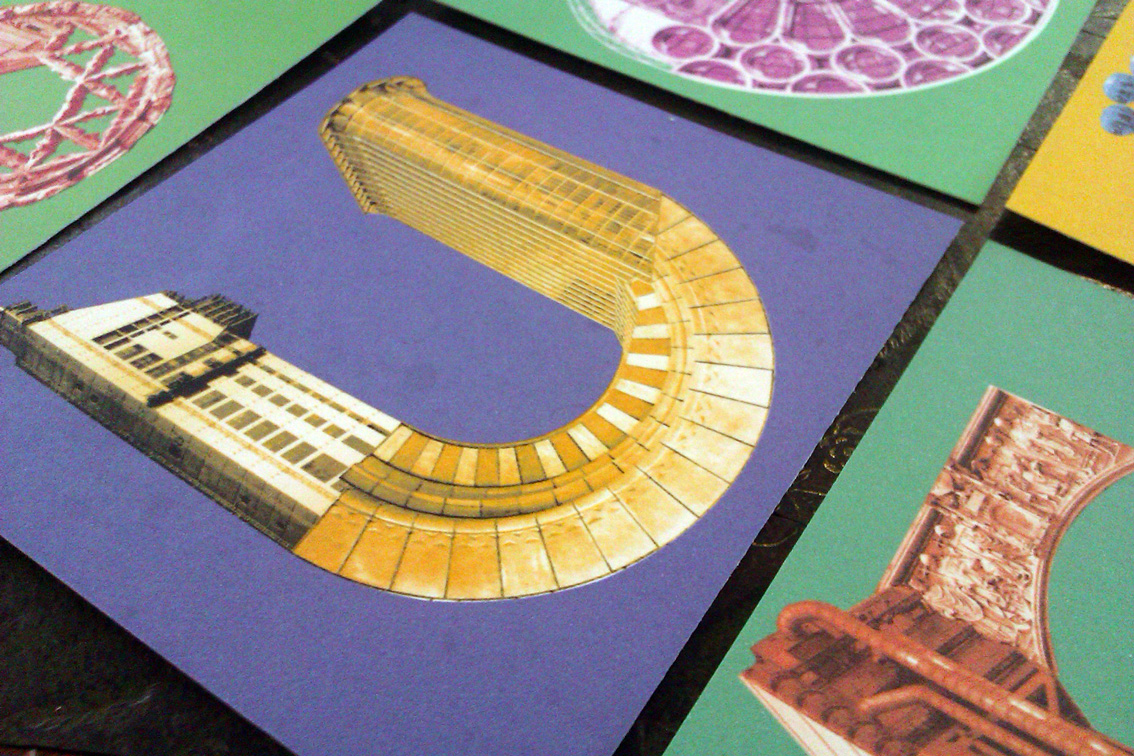
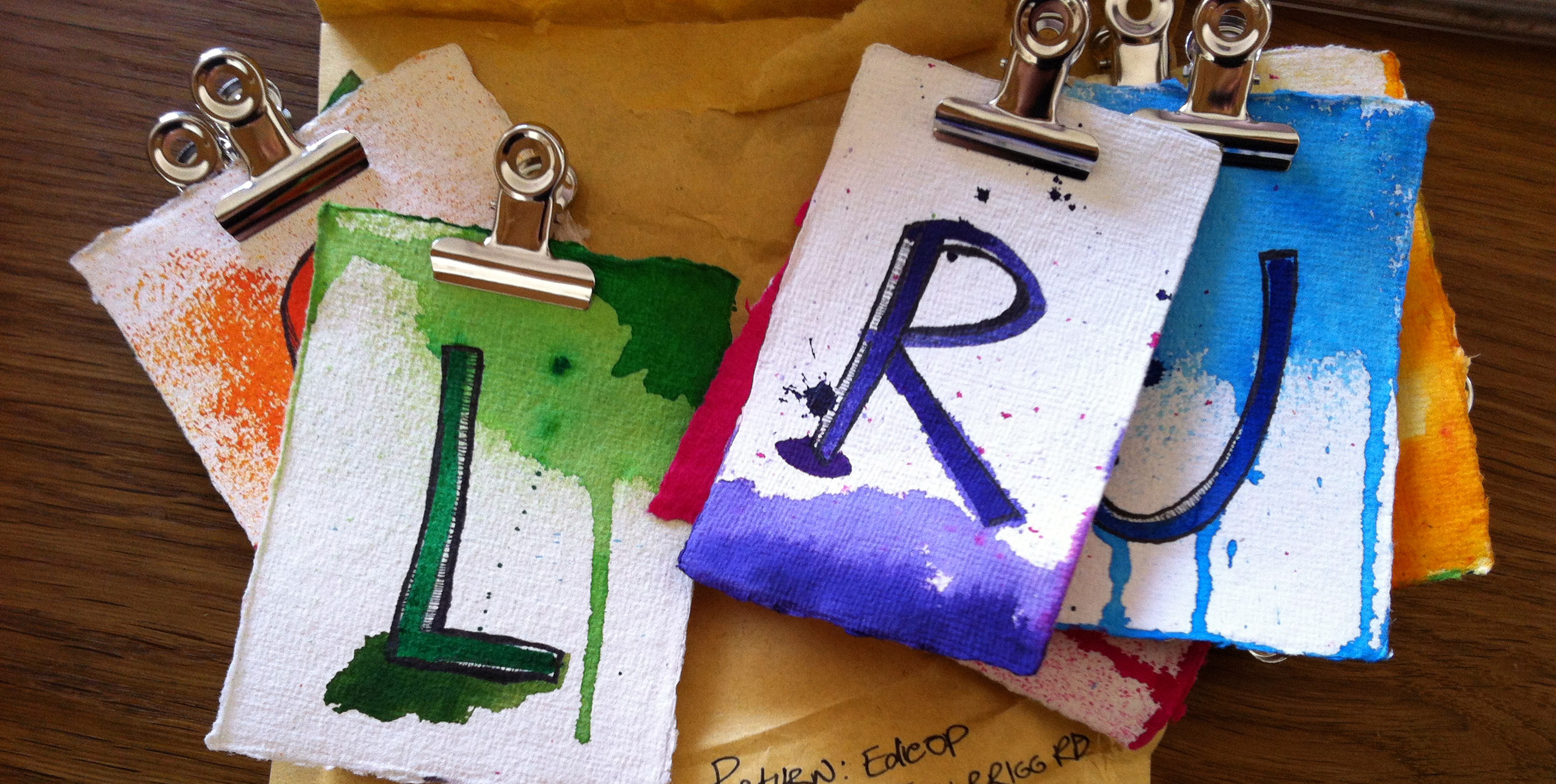
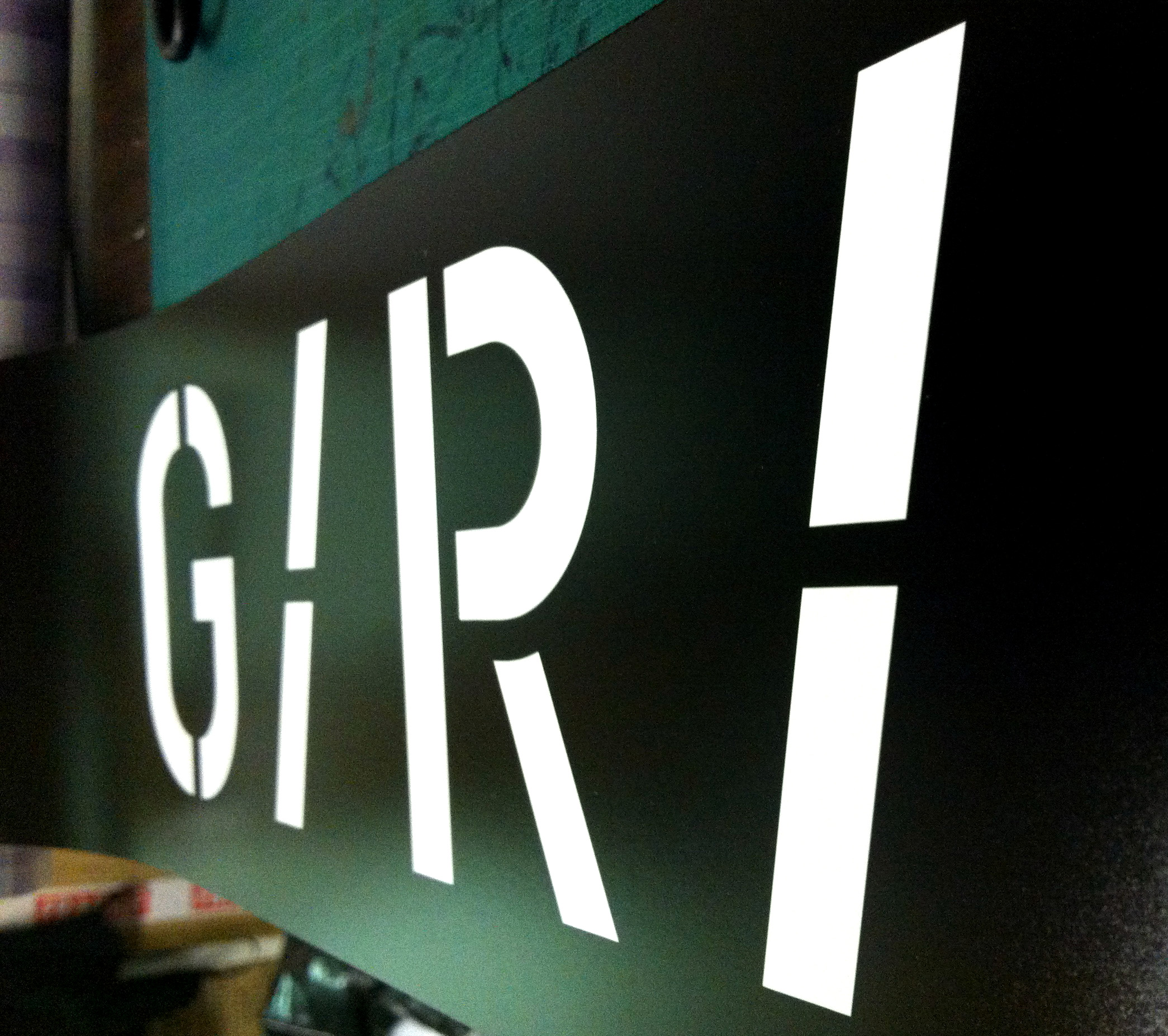
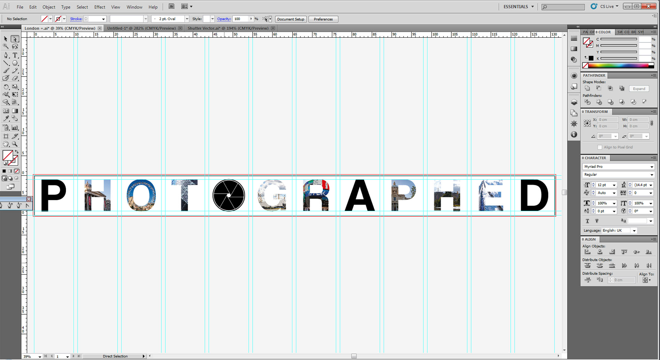
Type Tasting drop in workshops in which participants get creative to reinterpret letters inspired by streetsigns and signage from around the world. The variation of signage styles reflect social and historical development of typography in each region and will enable us to build up a visual representation of global typography trends. Participants will each be provided with a simple template for a letter which they will customise using a range of markmaking and collage materials. The event will be eight hours long, but participants can drop in at any time.
Speaker: Sarah Hyndman
Speaker: Sarah Hyndman