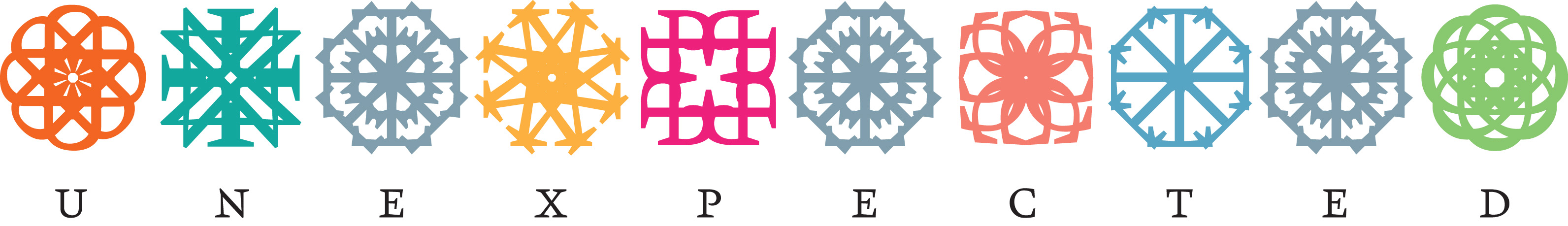
Sarah, we decided to give it a shot and we’re sending our entry in the attachment. The word we chose was “Unexpected” (we checked to see it was available). The typeface is our own (Kristal). The ornaments are composed of its characters.

Eyal Holtzman studied Graphic & Typographic Design at the Royal Academy of Art in
The Hague and then completed the Post Graduate course Type Design & Typography. Since 1996 he has been active as an independent artist, designer and lecturer.
In the book Dutch Type Jan Middendorp describes Eyal’s designs as being “among the most original alphabets produced in the Netherlands”, (…) “which were not based on
any model or fashion but were pure invention, tapping into an idiom that no other type designer working in the Netherlands has ever used”.
Myrthe Stel studied Graphic Design Communications at the Minerva Academy in Groningen. She combined graphic design with other disciplines such as screen printing and photography. After her studies she started teaching at the Minerva and later MIADA academy in Chongqing, China.
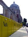
‘Unexpected’ by Eyal & Myrthe be displayed at Type Tasting with the London Design Festival 2013 at the V&A.
Drop in workshops: 10am – 5pm, 14 & 15 September 2013’London Design Festival Hub
Design Studio, Sackler Centre
V&A
Cromwell Road
London SW7 2RL