Kerry Rankine from Growing Communities went on a family trip to Como, Northern Italy, and shared her holiday photos.
Category Archives: Uncategorized
“Smile”
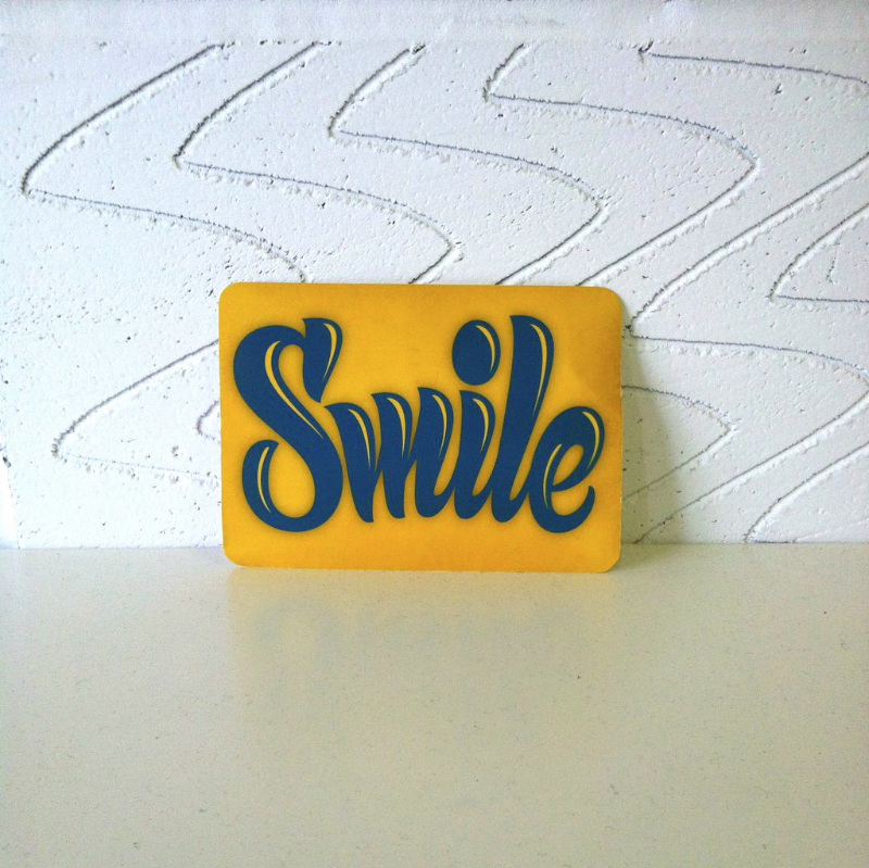
A postcard arrived at the Type Tasting studio in London from Martina Flor in Berlin as part of her Letter Collections project. Thank you Martina, it’s now sitting cheerily in the studio and we’re sure it made a few postmen smile on its journey.
Deckchair Alphabet

Sarah Hyndman’s Deckchair Alphabet features in the new book by Steven Heller (New York Times art director for 33 years) and Gail Anderson (former art director of Rolling Stone). In The Typographic Universe, they explore ‘the alphabet of everyday things’: letters found in unexpected places such as flowers, train sets, human bones or deckchiars. ‘Gail gave the assignment to her class and the rest fell into place,’ Heller says, adding that letters emerge in surprising places ‘almost as frequently as faces’. Anderson says: ‘I had my own burgeoning collection of found letters, so it was interesting to connect with others who were as intensely obsessed as me’
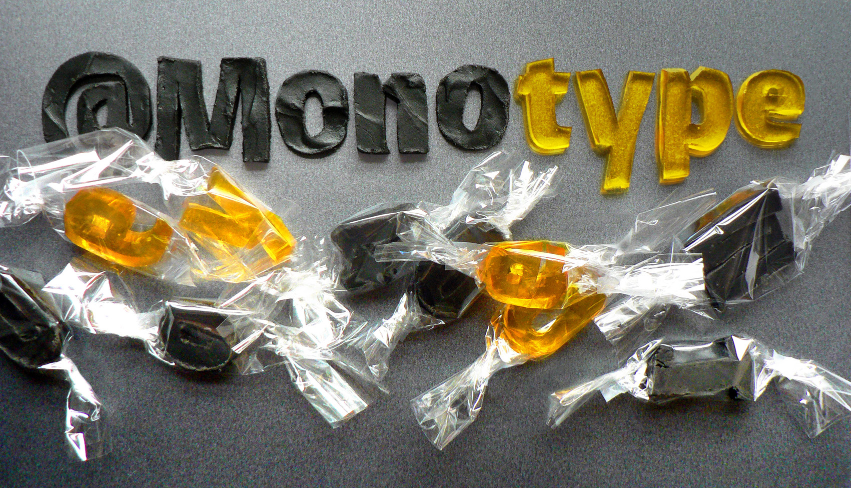
What would Monotype’s Burlingame typeface taste like?
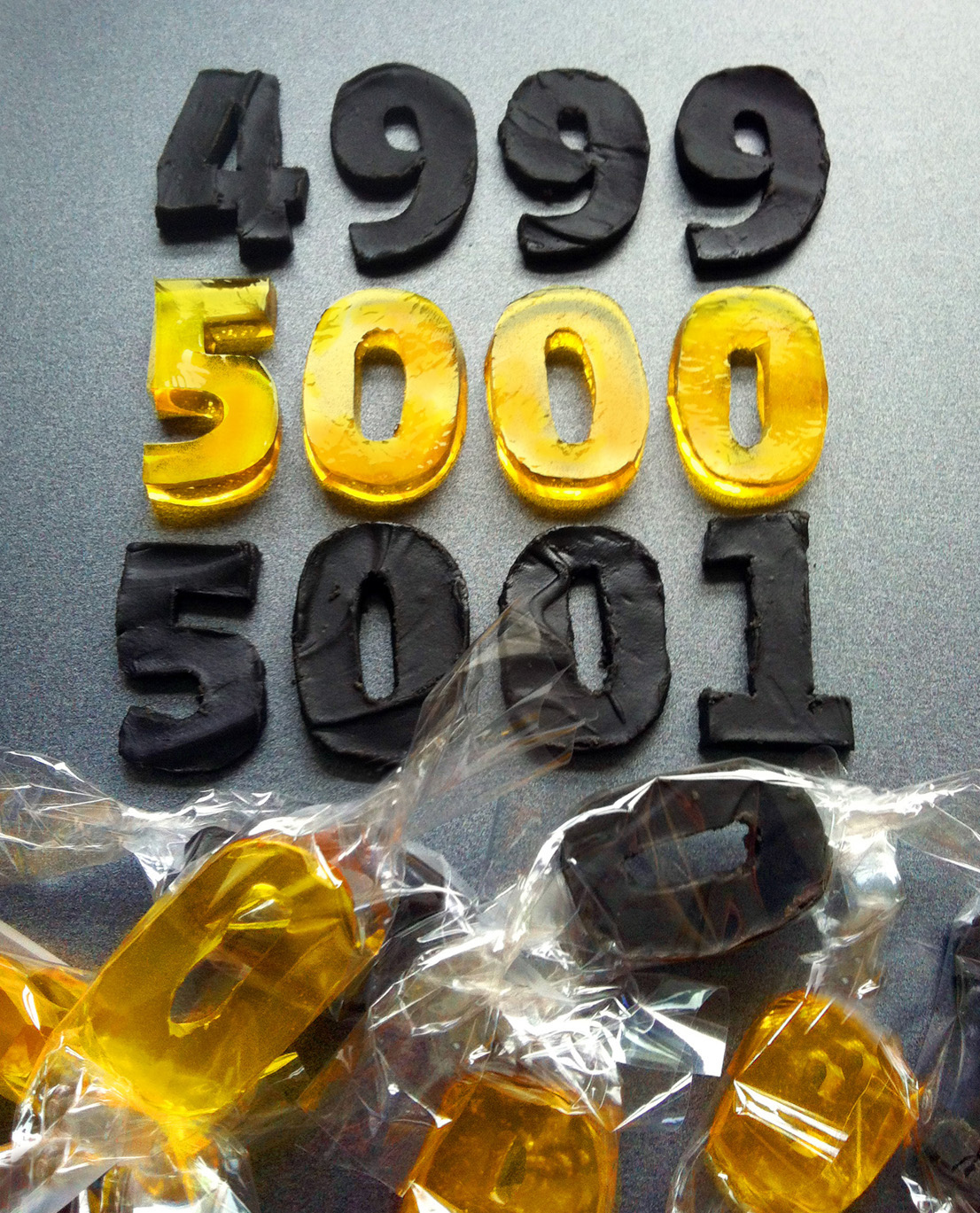
To celebrate their 5,000th Twitter follower, Monotype commissioned Type Tasting’s Sarah to create an edible version of their newest typeface release, Burlingame.
Burlingame was developed by Carl Crossgrove following pioneering investigations by Monotype into the legibility of vehicle displays. The research revealed a set of optimum criteria for dashboard display fonts: large counters and x-heights, simple shapes and a loose spacing of characters. It was found that a humanist sans serif typeface with these characteristics reduced male drivers’ glance time significantly.
Type Tasting chitchat from Twitter


@Monotype & @jamesfooksbale: “Just a little neon something we’ve got, waiting in the wings”, made by @Neoncreations via @TypeTasting

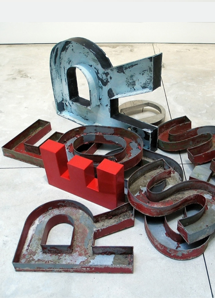
@TypeTasting: Order from chaos: Word sculptures from old type & signage by Jack Pierson via @inspirationgrid http://theinspirationgrid.com/word-sculptures-by-jack-pierson/
Typeface mash ups

Mr Cromso is a designer and street artist living in Paris, France. He’s been working on a self initiated project called Mixtype which asks the question “what would happen if letters from different type families procreated?” This is similar to an idea we’ve been playing with here at Type Tasting so I challenged him to do a Mixtype combination of a Blackletter typeface + Comic Sans, two hand drawn influenced styles separated by centuries (and opinions). After pronouncing it “a totally crazy choice!” he sent over the above composition. We like how this works, what do you think? What two typefaces would you like to see combined?
Fire and ice: elemental typography
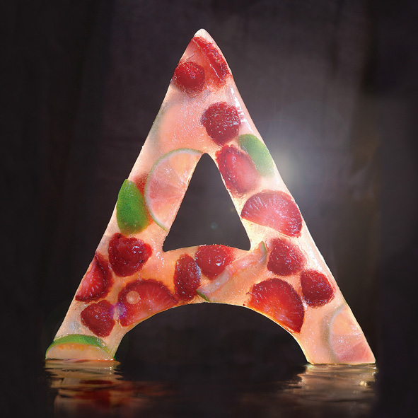

The making of the fire and ice ‘A’s.
The ice ‘A’ was an idea I had while walking along on a hot summer day, I was thirsty and really fancied an ice lolly. I started by building a 20 x 20cm silicon mold created by pouring the model making mixture over a cardboard reconstruction. This was then filled with water and fruit and left to set in the freezer (which took the best part of a weekend). I photographed it myself in my studio by suspending on fishing twine, back lit against a black background. The photo shoot had to be quick as I used a hairdryer to make the ice shiny, but this also meant that the ‘A’ melted quickly. Then it was just a case of Photoshopping out the twine and any background clutter.
Baskerville Earl Grey tea biscuits recipe
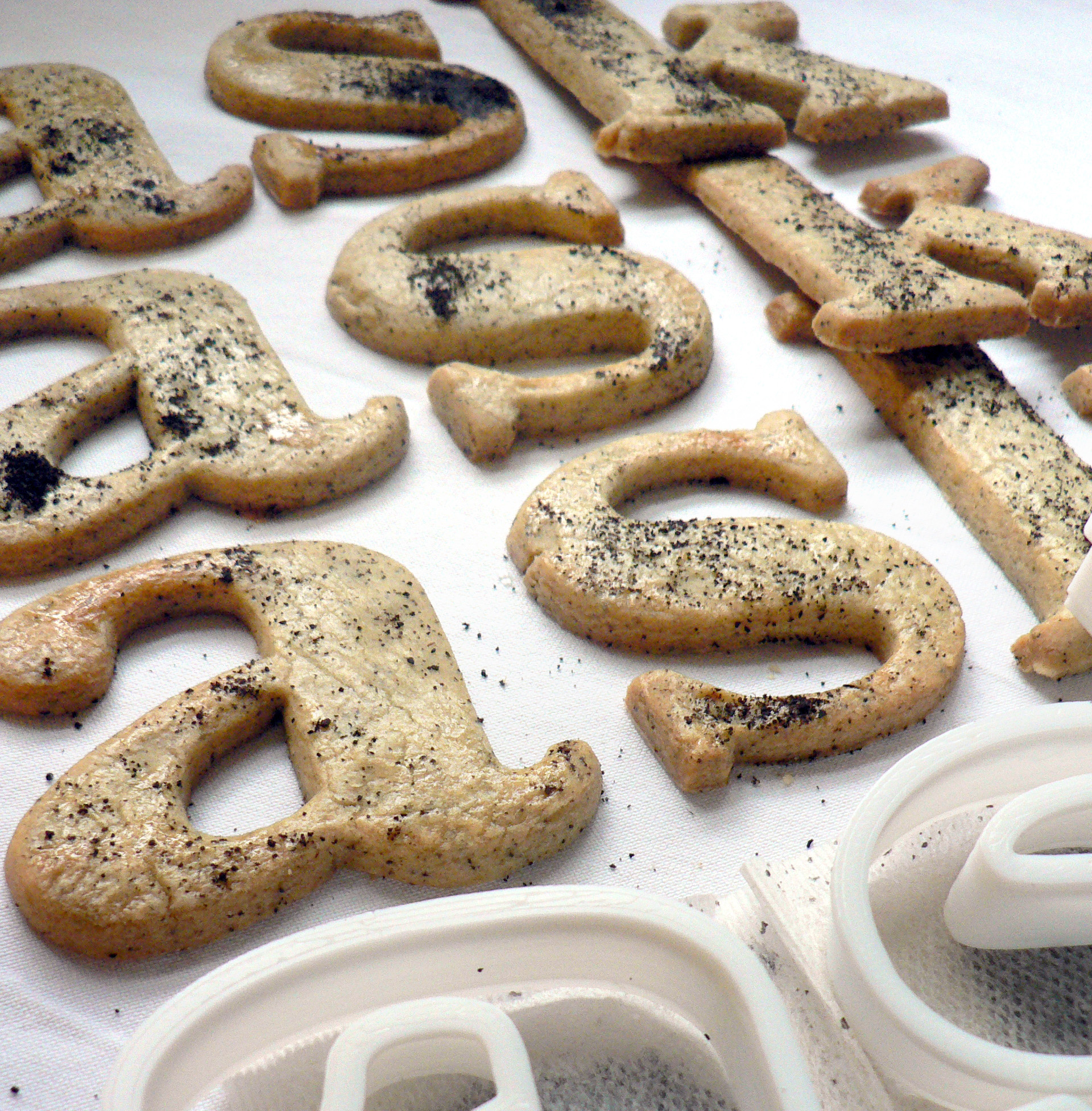
Baskerville Earl Grey tea biscuits recipe
Edible typography
Using food to describe the experience of typography
Baskerville is a transitional serif typeface that sits between the old style serif typefaces of William Caslon and the modern serifs created by Giambattista Bodoni & Firmin Didot. English printer and type designer John Baskerville developed a typeface with more defined angles and greater stroke contrast. This was a refined face with improved legibility which also took advantage of the improvements in technology happening in the 1750s. Baskerville is a recognisably English typeface that has stood the test of time as a legible, everyday text face.
My interpretation of Baskerville are Earl Grey tea biscuits for an authentic eighteenth century flavour. At this time improved technology and transport allowed foods to be enjoyed throughout the country. Tea had become the national drink and the tea leaves would be dried, rolled and used again. I had initially thought that Baskerville should be savoury, since it’s an everyday ‘jobbing’ typeface, but sweet biscuits tasted better.
Recipe
Helvetica water biscuits recipe
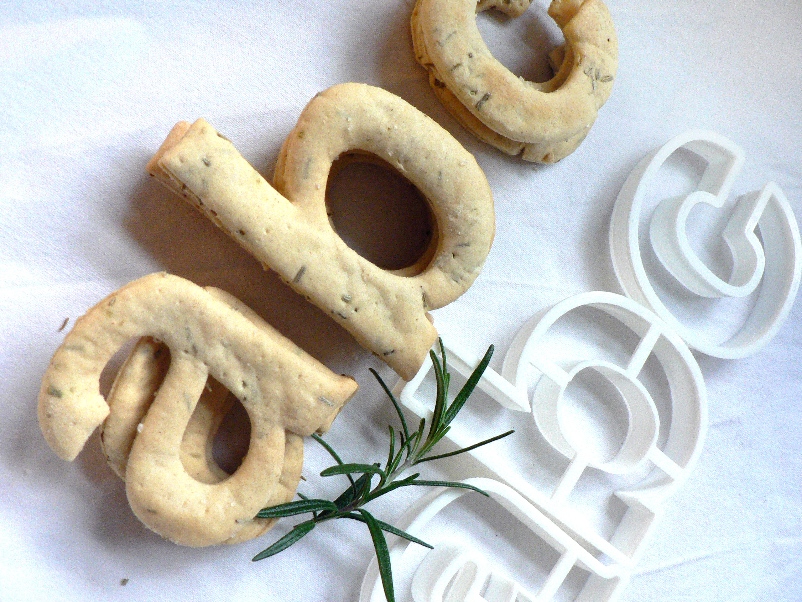
Helvetica water biscuits recipe
Edible typography
Using food to describe the experience of typography
The typeface Helvetica was created to be neutral and to have great clarity, but to have no intrinsic meaning of its own. It was intended that it could communicate any message, but without it being influenced by the style of the font in any way. i.e. clear enough to be used across a wide range of applications, but plain and neutral enough that that its sole purpose is to support the message.
My interpretation of Helvetica is to create it from savoury water biscuits which are plain enough that they can be included in a wide range of meals but take on the flavour and style of the food that they accompany. They have a sprinkling of salt to make them tasty enough to eat, and a dash of rosemary for a Swiss Alpine touch. Serve them with cheese, ham or a tasty dip.
Recipe
Talk: How I fell in love with Type
How I fell in love with Type
The Inspiring Speakers Programme Gala Finale hosted by Ginger Training & Coaching
Wednesday 19th March 2014
Type Tasting founder Sarah Hyndman tells the story of how she fell in love with the magic of type as a child. She discovered along the way how it can be used to influence, and that its power to enchant and to inspire is something worth sharing.
