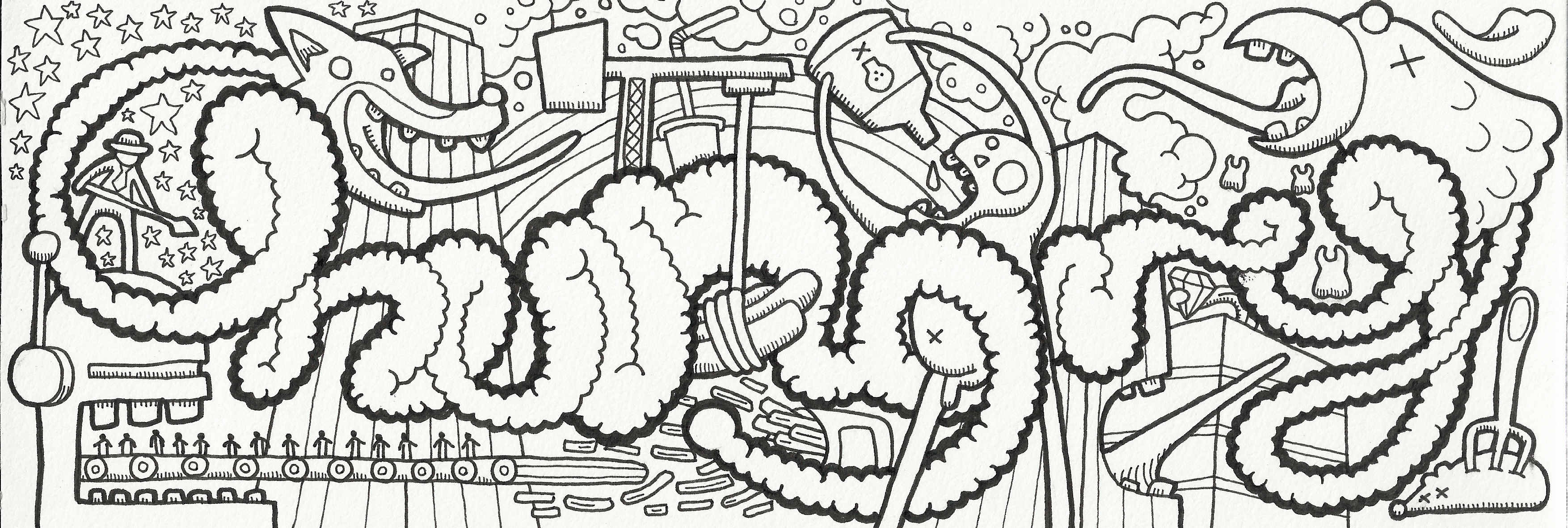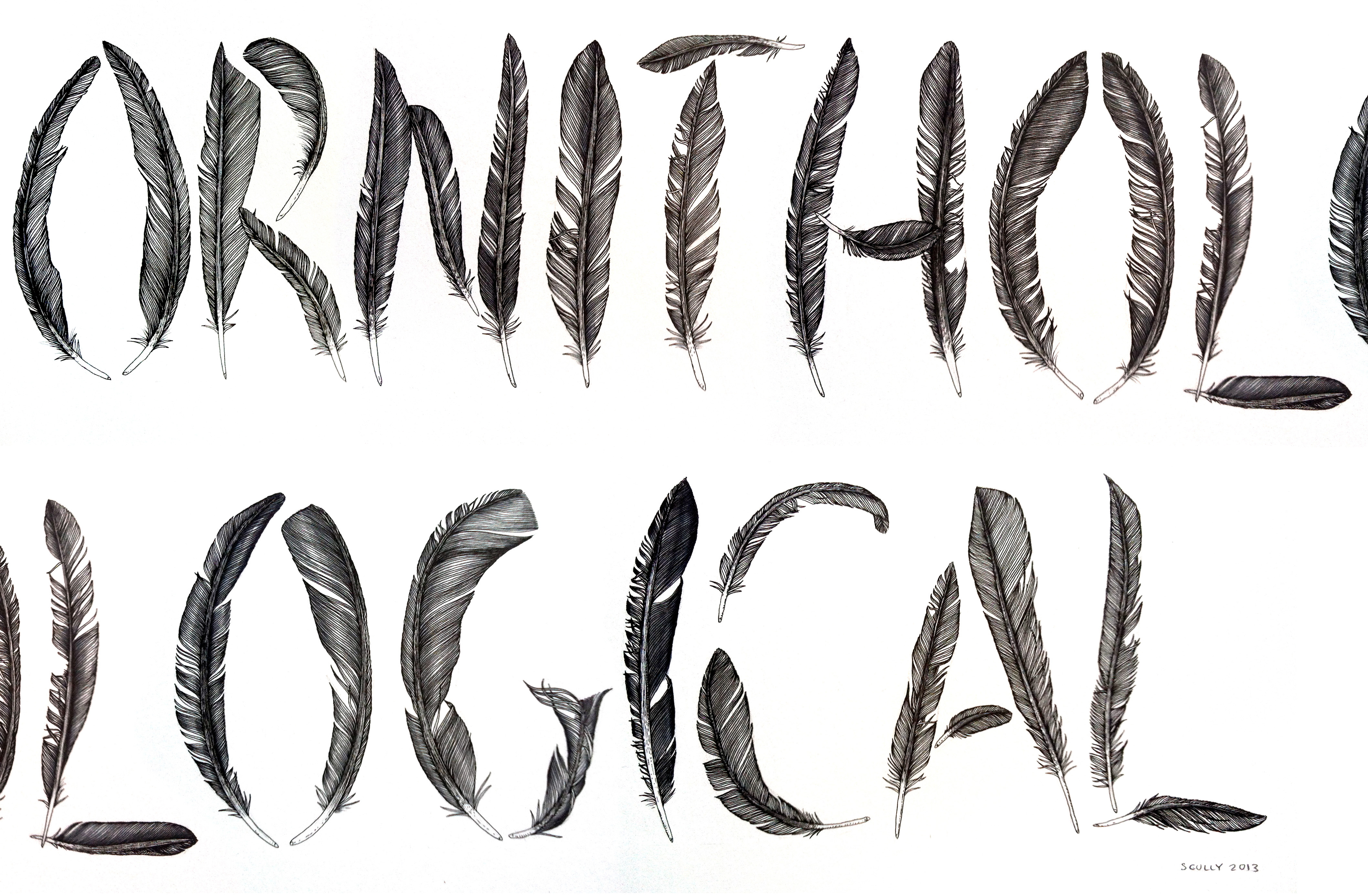
#LDF13 ‘Ornithological’ by Claire Scully
Scully’s meticulously hand drawn feathers display the level of intricate detail to be found in much her work including her typeface designs. ‘Ornithological’ was drawn late into the night after returning from a trip to the US to avoid dealing with jetlag.
The inspiration for Scully’s self initiated work often comes from my everyday surroundings of the metropolis and its relationship with the natural world. “I love 50’s, 60’s and 70’s architecture particularly tower blocks with their form and location, this is where I also find the connection to nature and natural patterns in the environment of interest.”