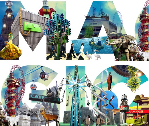
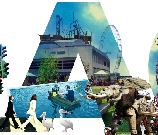
‘Magic’ by Julia Woollams
Julia Woollams is a graphic designer and born-and-bred Londoner (well, if you class Croydon as London, as she does!) She studied graphic design at Central Saint Martins and after a bit of freelancing at the BBC she started working at johnson banks design in Clapham, and is still there over a decade later. Although specialising in branding nowadays, she still loves the chance to do some image-making, especially if it involves the best city on earth (she’s not biased at all…).
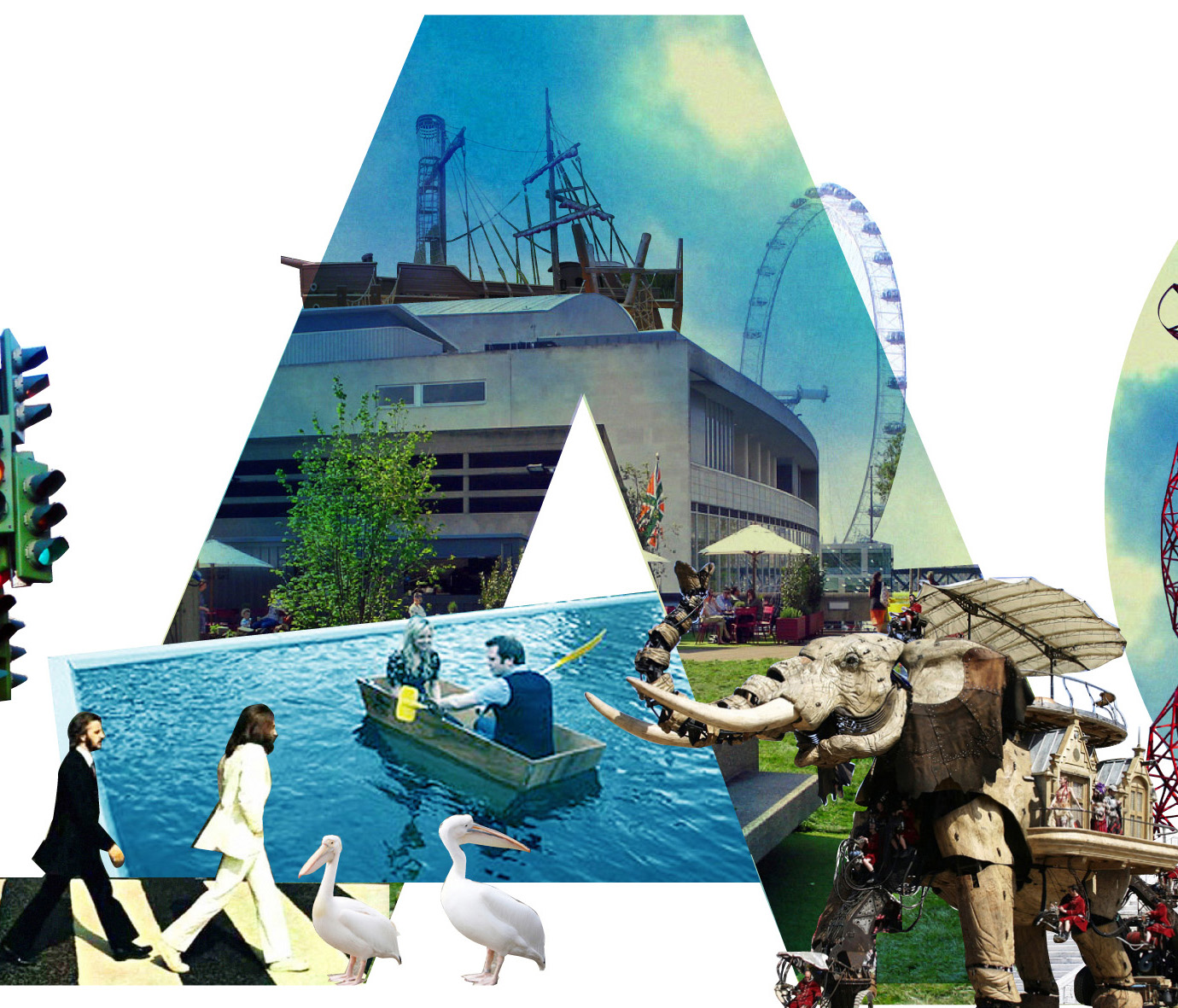
“London is magic to me, as it is full of so many magical things to do and see, that aren’t necessarily part of the conventional tourist trail. My ‘Magic’ Collage is made up of just some of the things that make me love London”
Continue reading →


