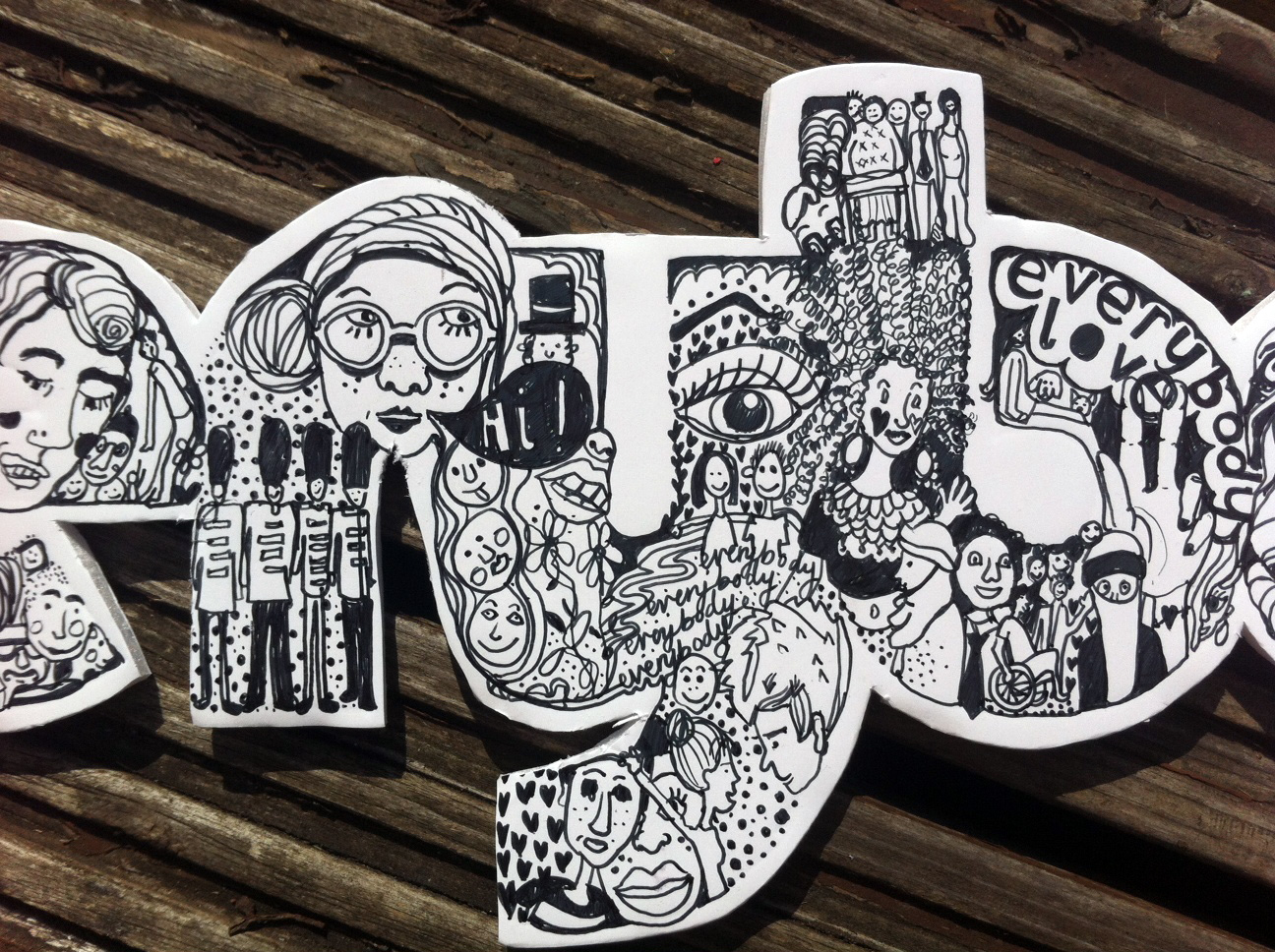
‘Everybody’ by Lucy Parris
“I knew I wanted to create a piece where the typography works as an image in itself, so I wanted to illustrate my thoughts and feelings on my chosen word, ‘everybody’.”
‘Everybody’ by Lucy Parris
“I knew I wanted to create a piece where the typography works as an image in itself, so I wanted to illustrate my thoughts and feelings on my chosen word, ‘everybody’.”
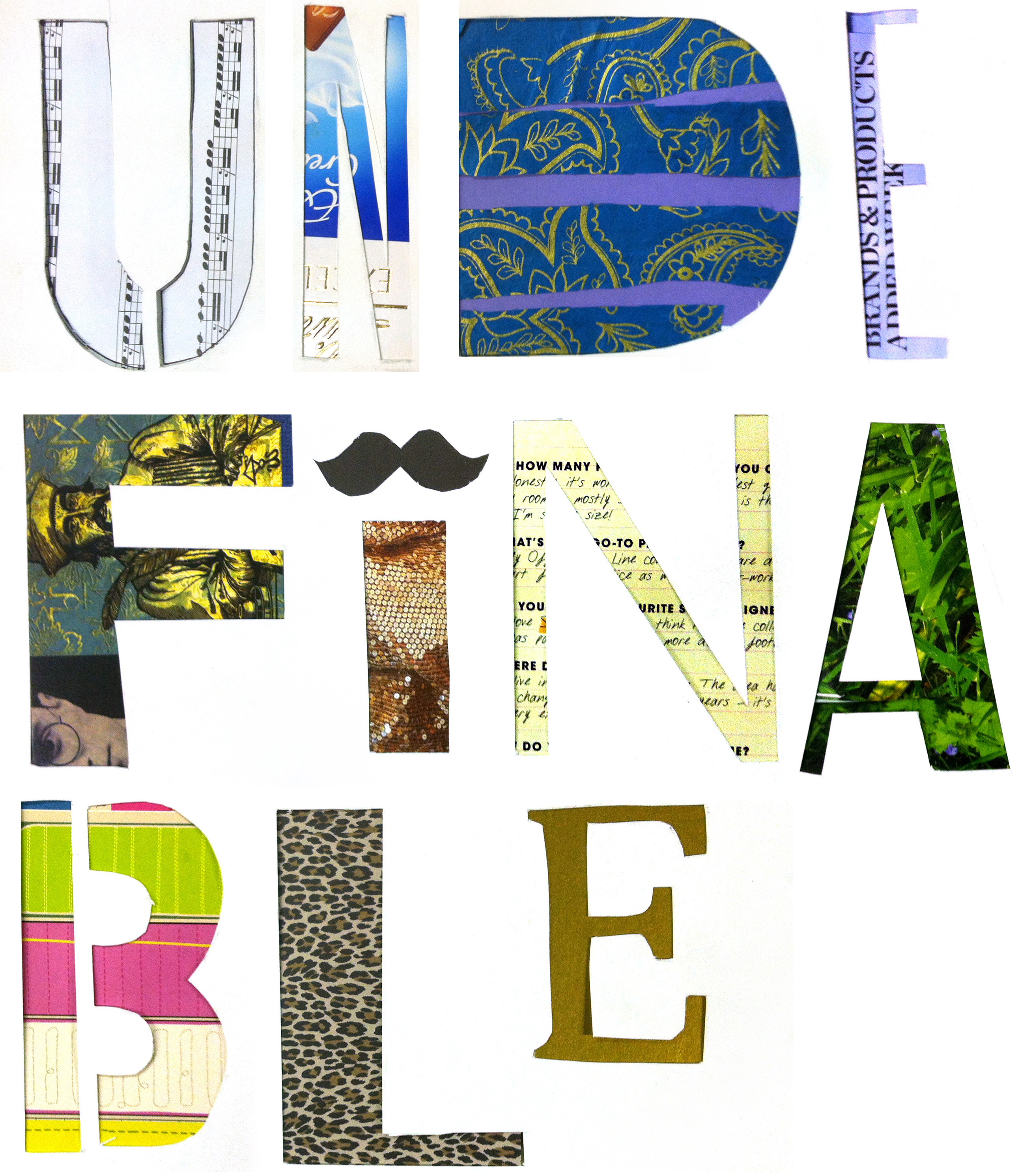 Undefinable by Elsa Marianelli
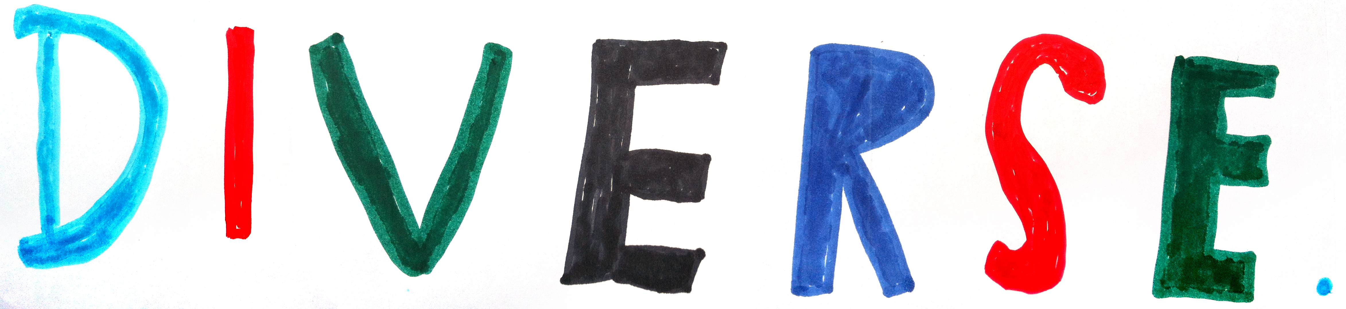
‘Diverse’ by Michael Attenborough
‘Diverse’ is a perfect word both for creative London, and to describe Attenborough’s work—from the range of productions he champions in his role as theatre director, to the scope of his directorial work.
Michael Attenborough is a talented and prolific English theatre director. He was the Artistic Director of the Almeida Theatre in London from 2002 until earlier this year when he stepped down to concentrate on his directing career. He was appointed Commander of the Order of the British Empire (CBE) in the 2013 Birthday Honours for services to the theatre.


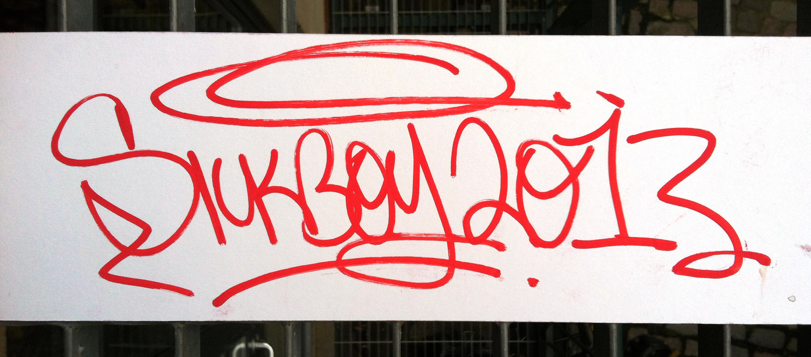
‘Saviour’ by Sickboy
Sickboy moved to London in 2007 and his street art became prevalent particularly in the East End boroughs of Shoreditch and Tower Hamlets. He originally trained in Fine Art and, as well as painting graffiti on the street, he also paints on canvas and exhibits conventionally in art galleries. He has been painting street art since 1995.

‘Cretinous Relations’ by Ralph Steadman
Ralph Steadman is one of the most influential and provocative British artists, whose ink splattered style, anarchic wit and characteristic figures are immediately recognisable.
Today is the premiere at the Toronto Film Festival of For No Good Reason of a film about his work by Itch Films, directed by Charlie Paul.

‘Temporary’ by Anthony Peters
“Many of the words picked by contributing artists for this project are celebratory, my first word is quite the opposite, A reflection on the homeless ‘culture’ and the existence of the homeless beneath the noses of the daily grind. Everything is temporary when you get moved on, when you nomadically source food, shelter and friendship. The material (cardboard) reflects a material used as shelter and as a ‘padding’ to buffer the hard cold concrete beds which many people sleep on in the city that never sleeps. Cardboard itself is temporary, ideally this piece of typography would be exhibited in a city doorway, to be poached and weathered until it is no more.”

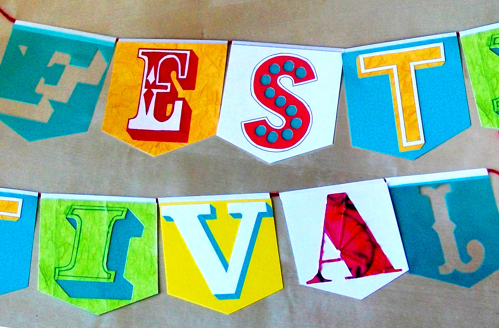
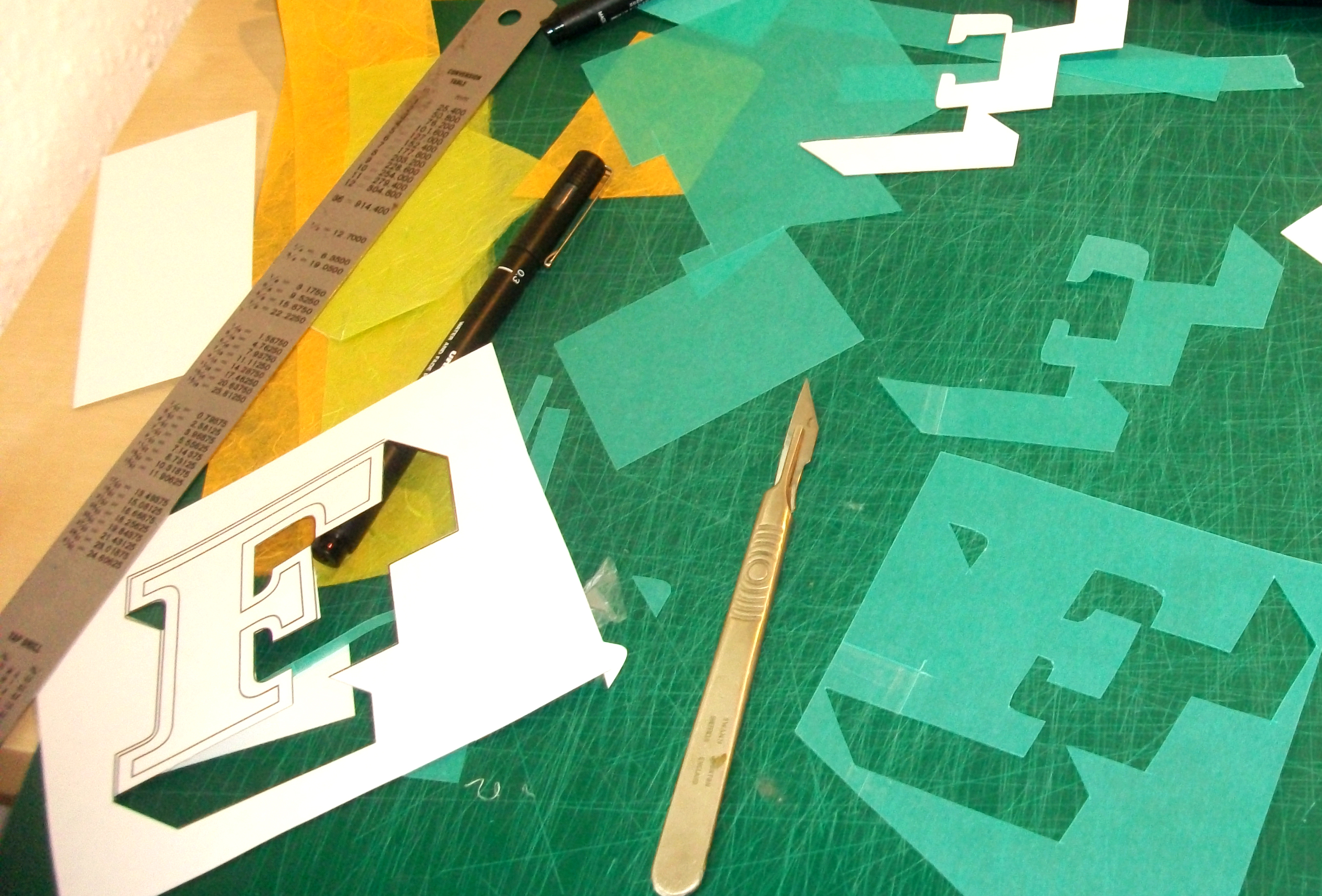
‘Festival’ by Zoë Chan
“My main inspiration for ‘Festival’ is my love of vintage signage and type, especially that which typifies ‘Britishness’ and has been used in various street and building signs around London over the 19th-mid 20th Century. My passion is type in the environment / spatial type, and aside from the typefaces used being taken from signage I chose to display it as bunting; this both embodies the idea of festival and celebration and it can be hung in any environment, both inside and outside. My colours and materials used signify the excitement, eclecticism and cacophony of sights, sounds and emotions found around London.”
‘Stories’ by Emli Bendixen
(assisted by Tilly the dog)
Bendixen is a Danish/Korean photographer based in London. She shoots editorial and commercial work with a particular interest in people and their environment. Follow her on Twitter.


‘Never-ending’ by Double Dagger
Double Dagger is a newly forged lettering collective of Alice Mazzilli and Karis Benjamin. Rooted in the disciplines of calligraphy, street art & tattoo art they enjoy working on various surfaces from refined paper to walls. Literature, old books and timeless quotes are a crucial parts of the way they work with letterforms.


‘Vintage’ by Madeleine Jablonowska
“I chose the word vintage because I am attracted to vintage style things such as the style of certain benches in London (angels on the sides etc) and old street signs and road signs with a pointing hand. I learned French script when I lived in Paris and thought that style was vintage”


