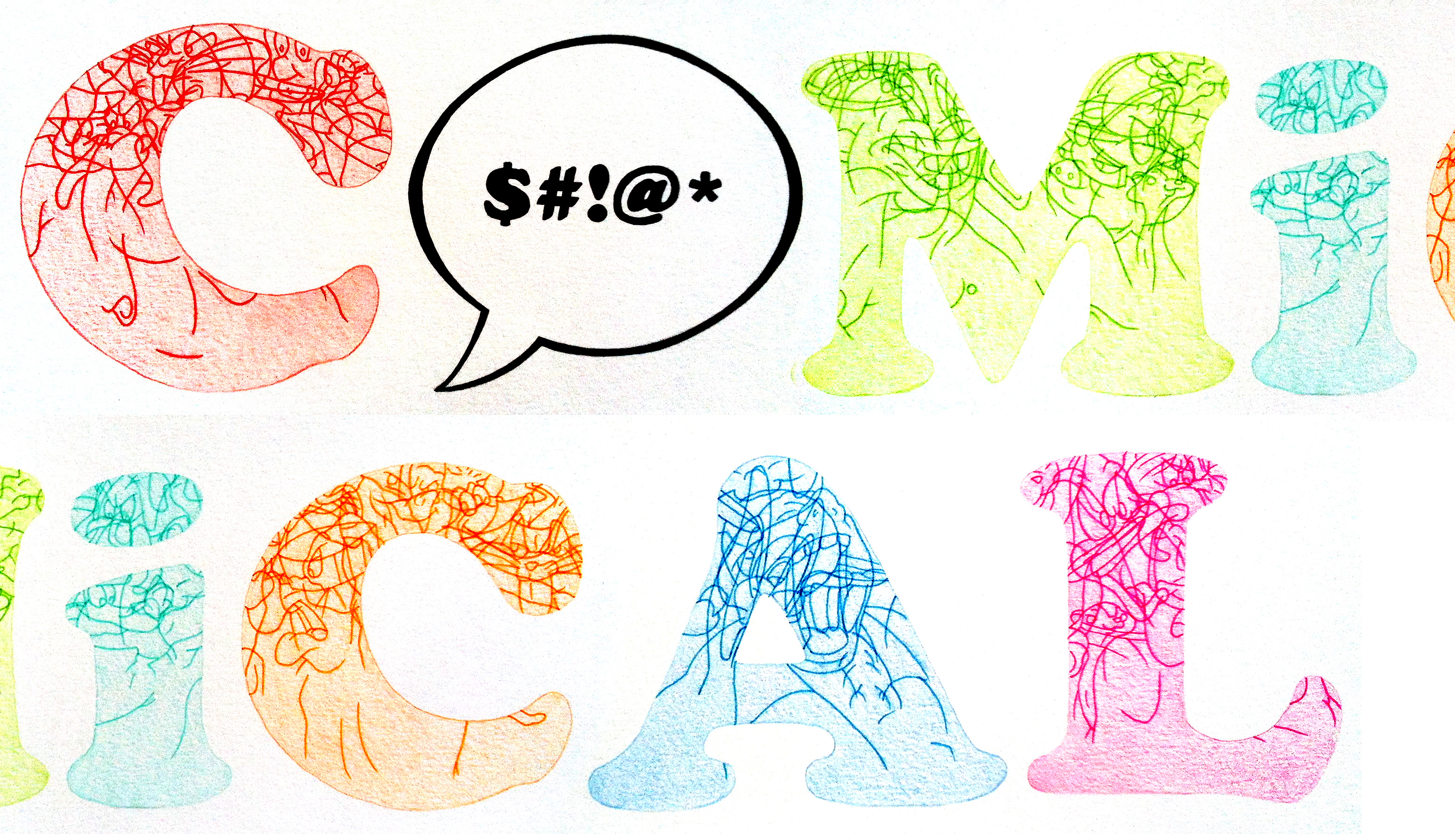
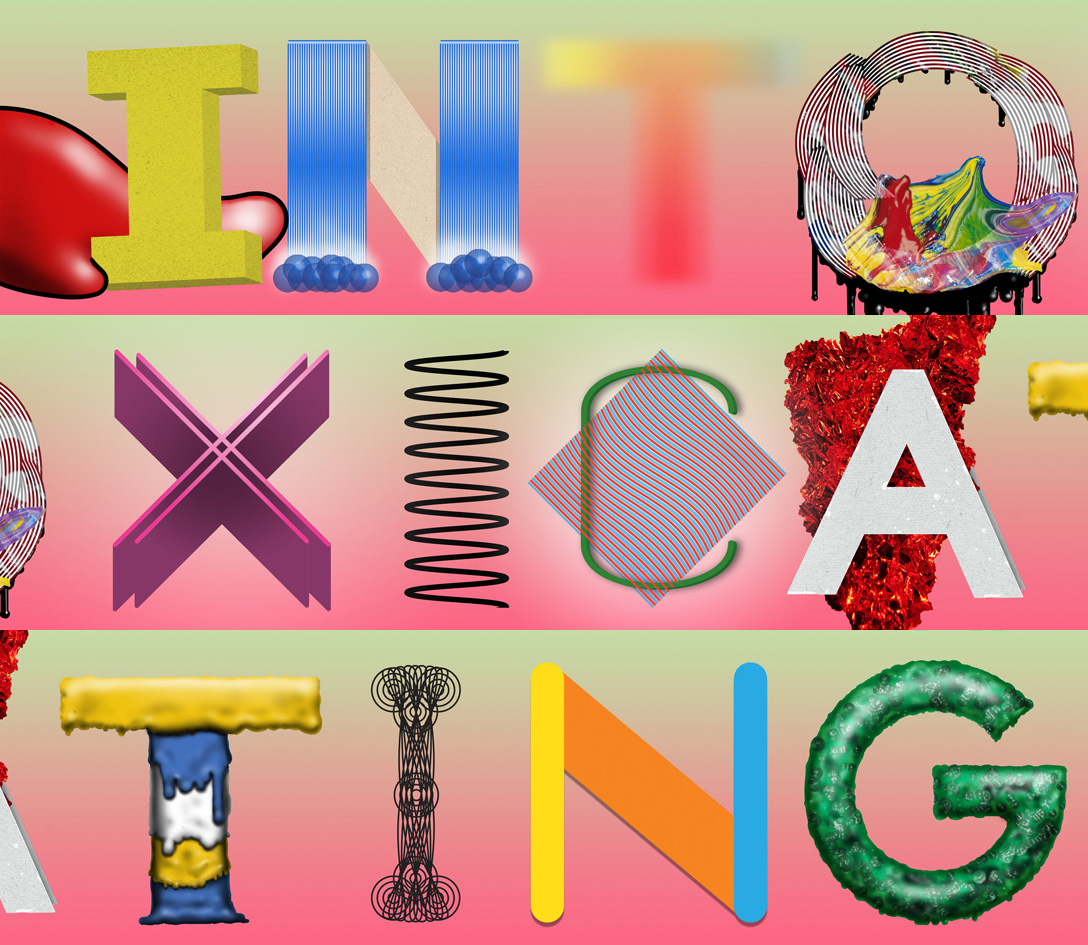
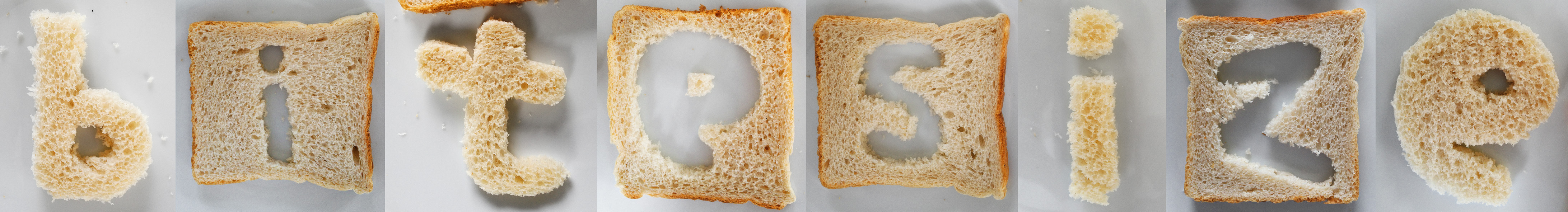
‘Comical’ by Michael Huppatz
Michael Huppatz is an artist based in Wollongong, an hour south of Sydney, Australia. When coming up with a concept for his word ‘Comical’, Michael worked through a few different ideas. His first thought of having the letters appear as some sort of tooth-filled, laughing Pac Man character as if envisioned by Robert Crumb was scrapped. His next idea was to have the crazy legs of the Ministry of Silly Walks forming the letters of the word, “but this ended up looking too… um, silly.”


