Tag Archives: london design festival

‘Gems’ by Syd Hausmann

 SHausmann-TT-Final2 lr
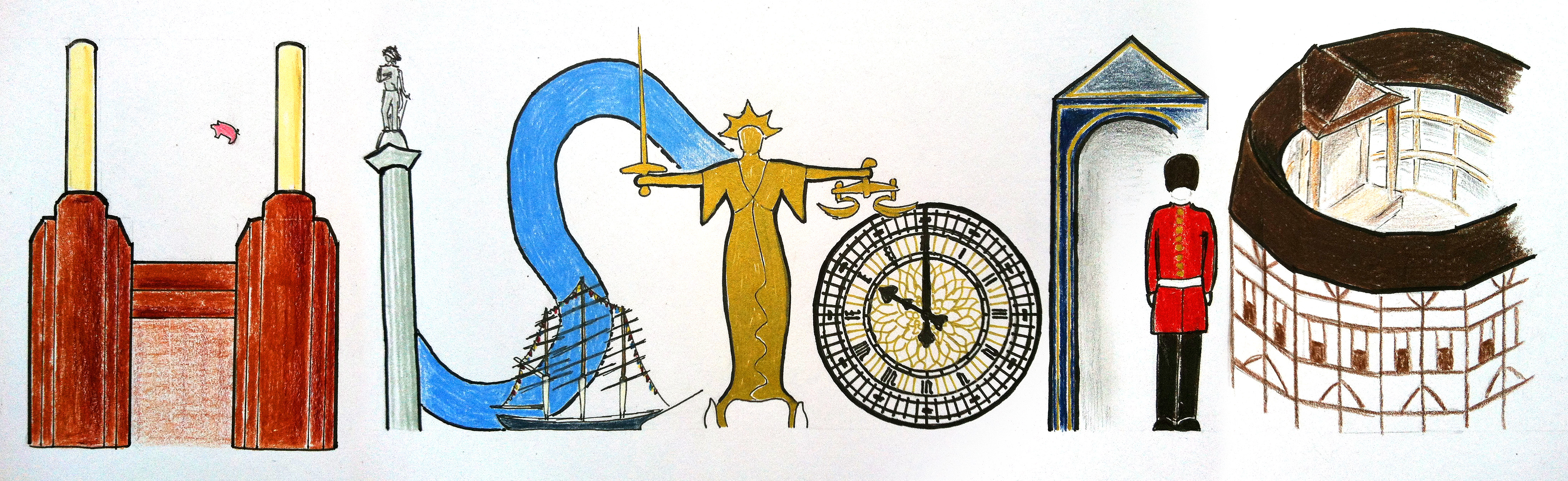
‘Gems’ by Syd Hausmann“When I got the brief for this project, one of the first things that popped into my head were the colourful, spiky potatoes that debuted a few years on London’s bus shelters – and how much I loved them. And I thought of all the things that made the city so wonderful: the people, the things to do, the diversity, the energy.. but it’s the unexpected surprises that truly delight me. From a potato on a bus shelter to a whole new area in London previously unvisited, my word had to be: hidden gems.”

Black = GEMS
Pink = Hidden

Continue reading

‘Artistic’ by Anne-Louise Quinton

Artistic Anne-Louise Quinton

‘Artistic’ by Anne-Louise Quinton

“I trawled through the websites of the galleries and museums of London, looking at their fonts.  What is glaringly obvious is how many have stayed safe with a classic serif non-descript, yet elegant style.”

Continue reading

‘Welcoming’ by Luisa Sieiro

Wall

‘Welcoming’ by Luisa Sieiro

“I chose the word WELCOMING because when I came to London almost six years ago, I felt like this was my home. London opens its doors to all kind of people and cultures, and that is what makes it a great city.”

Continue reading

‘Global’ by Madhu Amodia

global

‘Global’ by Madhu Amodia

Graphic designer Amodia who lives and works in Mumbai, India, explains that “London is the most diverse city in the world. There are approximately 250 languages spoken in London, and you can meet people of those many nationalities here. The British capital is a cultural pot potpourri, and hence the transaction of diverse currencies happen on a daily basis. The idea here depicts the currencies ( G: Georgian Lari, L: Libyan Dinar, O: Omani Rial, B: Brazilian Real, A: Argentine Peso and L: Lithuanian Lita ).”

madhu_monkey

Continue reading

‘Hectic’ by Claire Rye

 process 2 process 3
‘Hectic’ by Claire Rye

I chose the word Hectic as that just sums up London life for me, my life is always hectic here. With that I decided to completely over do my piece. A make as much of each letter and the surrounding background space as possible.

Continue reading

‘Collective’ by Jenn Kemp & ‘Diverse’ by Tom Jarrett

Collective_Jenn Kemp

‘Collective’ by Jenn Kemp

DIVERSE_Tom_Jarrett_submission

‘Diverse’ by Tom Jarrett

Jarrett explains that “I choose the word Diverse because to me it’s the best thing about London, the diversity in people, areas and cultures makes London what is. I started by looking at maps and areas of London and then developed the concept of using street routes to create letter forms and utilised Google maps to make routes around London to spell out my chosen word.”

Continue reading

‘Victory’ by Zakhar Shlimakov

Victorious Zakhar Shimlakov
‘Victory’ by Zakhar Shlimakov
Shlimakov lives in Minsk, Russia and explains that “In my country time is frozen — government and so many people, are still living in the past in times when USSR won in the WW2. It’s a reason
why we have so many names, signs and toponyms with the «Victory» in it. We still living in the 1945. It’s a lettering from sign of the oldest cinema in the Minsk which name is «Victory» — Победа.”

‘Used’ by Roger Dean

Used Roger Dean lr

‘Used’ by Roger Dean

“I think it is important to use London. What is the point in putting up with the commuting, the noise, the crowds and the expense if you don’t use the place? Being a photographer I had to find my word rather than create it and so USED, which I spotted only recently whilst out working on Esoteric London, seemed perfect for the London Design Festival project. It appeals to me visually, but I also like the way that the word has already been used in one particular location, for a particular purpose, and now I have appropriated it and reUSED it in another.”

Continue reading

‘Typeset’ by James Webb

Typeset James Webb

‘Typeset’ by James Webb

Webb’s piece for Type Tasting comprises of an extract from Charles Dickens’ Our Mutual Friend, written and set in London in 1865. The extract is about the River Thames and the typeset letters have taken on a suitably watery feel.

Continue reading