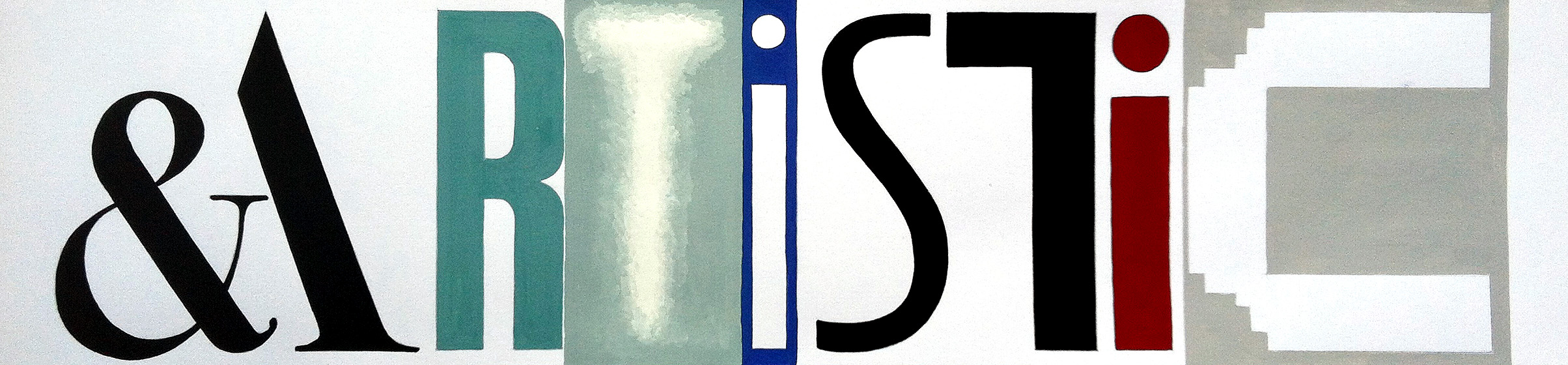
‘Artistic’ by Anne-Louise Quinton
“I trawled through the websites of the galleries and museums of London, looking at their fonts. What is glaringly obvious is how many have stayed safe with a classic serif non-descript, yet elegant style.”
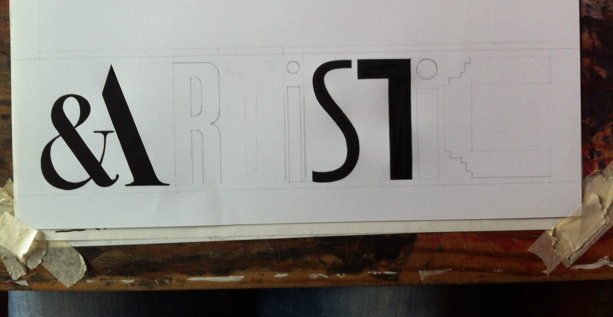
“It was immediately obvious that I should start with the A from V&A, as the ampersand/A is instantly recognisable. The R from the Royal academy came next. Luckily the new-ish Photographers’ Gallery had a great T. The Tate has quite a range of fades and colours to choose from. The aqua grey background was too similar to the R at first, so I darkened the R for greater contrast. Using the C from Whitechapel gave a solid and bold end to the word, the grey toning well with the other colours. The hardest letters were the two ‘i’s. So the background colour from the Barbican was useful, along with the colour from the National Portrait Gallery to finish it off.”
Quinton was a technical illustrator and graphic designer and is now a secondary school teacher in the art and design department. Her final piece is hand painted in gouache on cartridge.

‘Artistic’ by Anne-Louise Quinton be displayed at Type Tasting with the London Design Festival 2013 at the V&A.
Drop in workshops: 10am – 5pm, 14 & 15 September 2013’London Design Festival Hub
Design Studio, Sackler Centre
V&A
Cromwell Road
London SW7 2RL