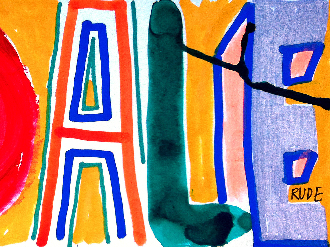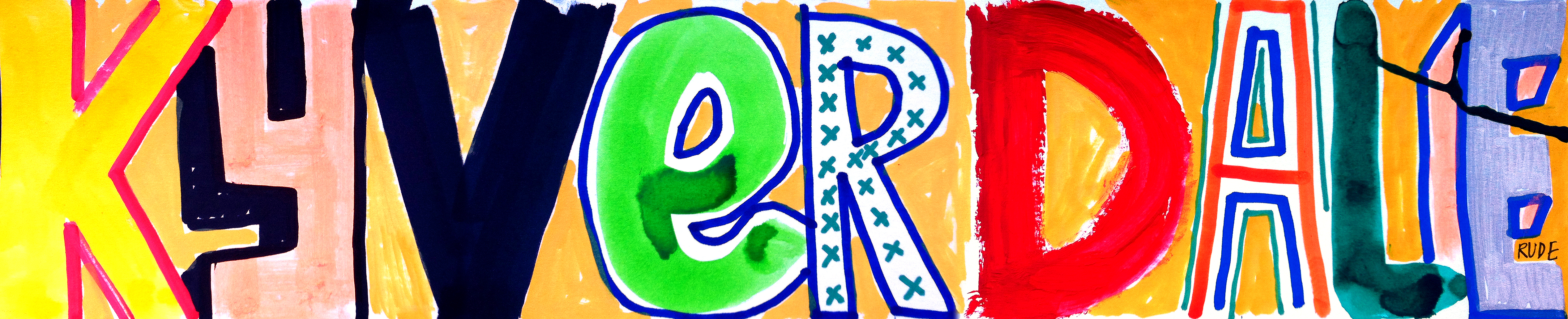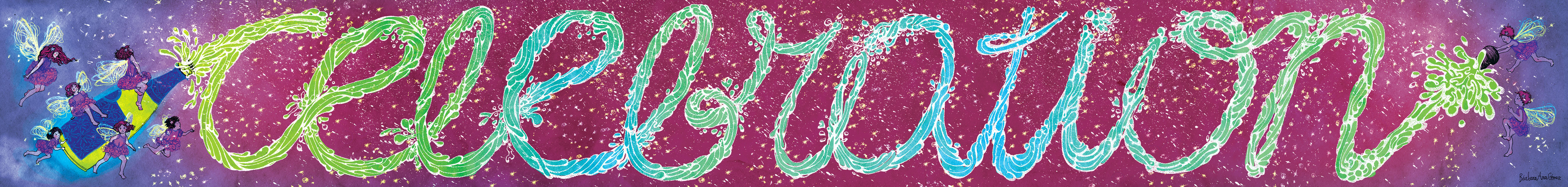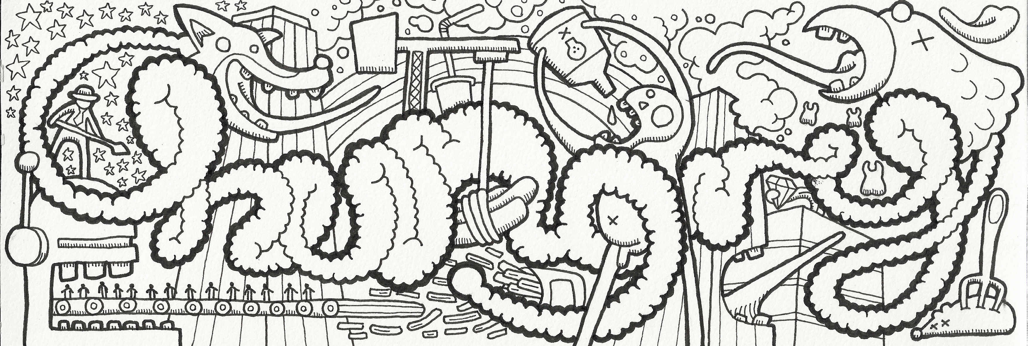
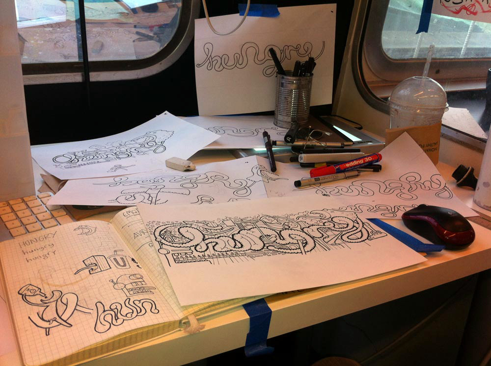
#LDF13 ‘Hungry’ by Nic Hinton
Click on the images to enlarge them.
London based illustrator and designer Hinton explains that “I chose the word HUNGRY because of the struggle, the ambition, the consumption of London.”
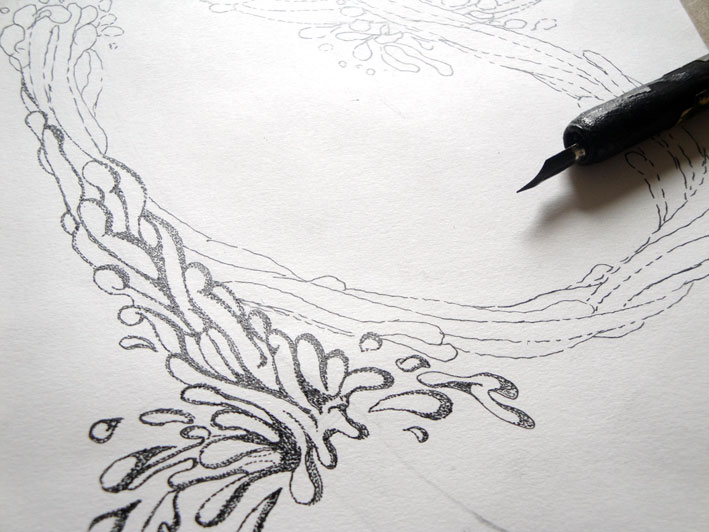
“My hand drawn illustration work tends to look quite random but there is a reason, no matter how thin, behind each mark. Sometimes things don’t turn out as I planned but that’s part of the fun right?…”