I chose the word Hectic as that just sums up London life for me, my life is always hectic here. With that I decided to completely over do my piece. A make as much of each letter and the surrounding background space as possible.
Tag Archives: typography
‘Collective’ by Jenn Kemp & ‘Diverse’ by Tom Jarrett
‘Collective’ by Jenn Kemp
‘Diverse’ by Tom Jarrett
Jarrett explains that “I choose the word Diverse because to me it’s the best thing about London, the diversity in people, areas and cultures makes London what is. I started by looking at maps and areas of London and then developed the concept of using street routes to create letter forms and utilised Google maps to make routes around London to spell out my chosen word.”
‘Historic’ by Alisa Lilly Moss
“I moved to London 22 years ago, and now I wouldn’t live anywhere else. I’ve been working for English Heritage, so I knew Historic was my word.”
‘Victory’ by Zakhar Shlimakov
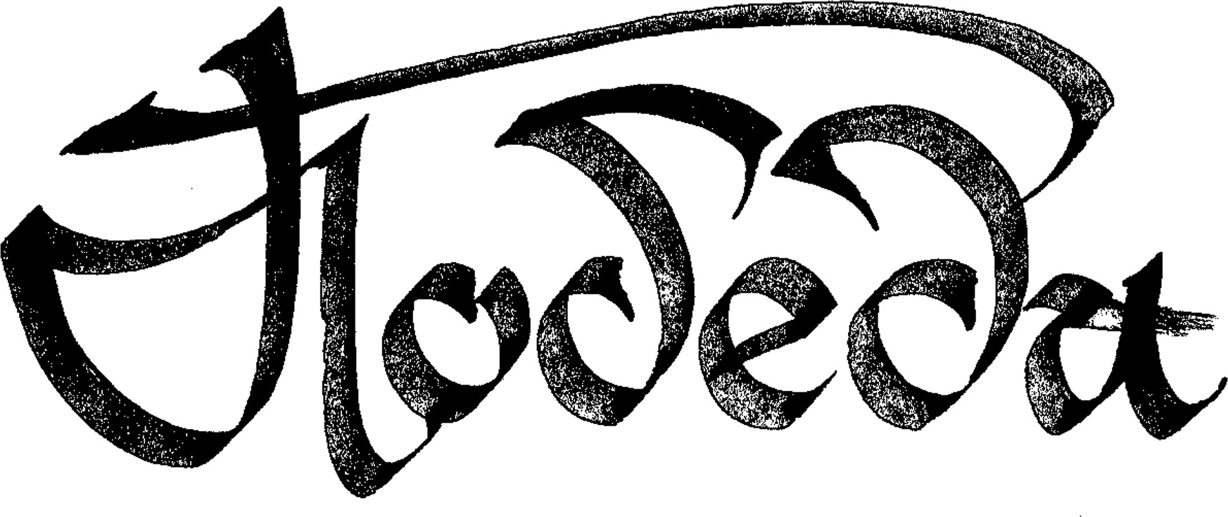
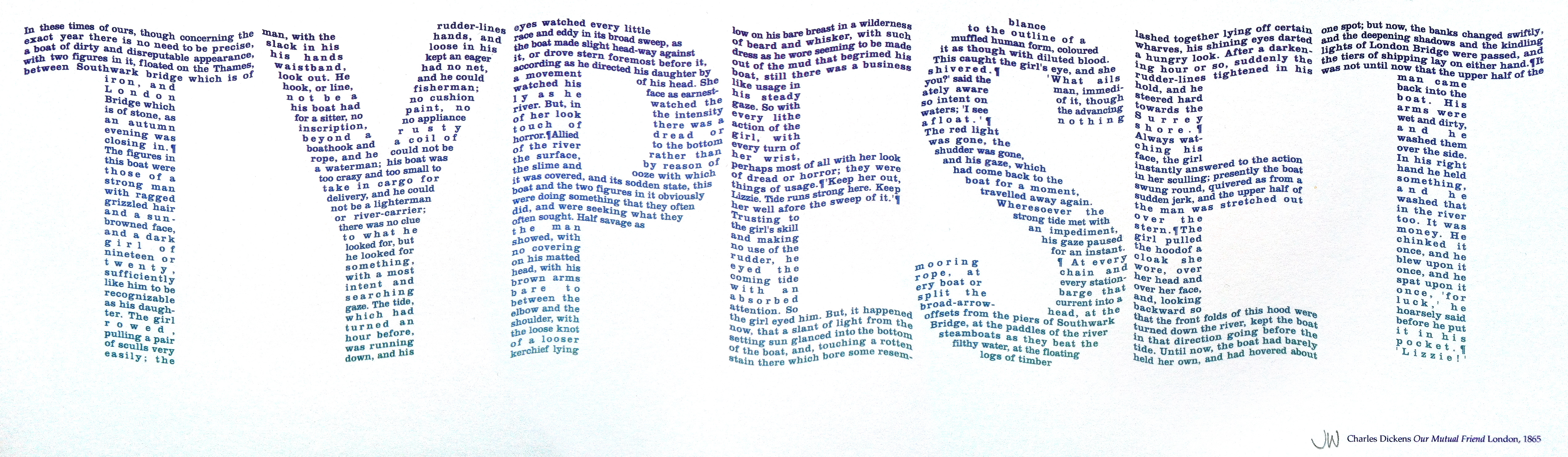
‘Used’ by Roger Dean
“I think it is important to use London. What is the point in putting up with the commuting, the noise, the crowds and the expense if you don’t use the place? Being a photographer I had to find my word rather than create it and so USED, which I spotted only recently whilst out working on Esoteric London, seemed perfect for the London Design Festival project. It appeals to me visually, but I also like the way that the word has already been used in one particular location, for a particular purpose, and now I have appropriated it and reUSED it in another.”
‘Typeset’ by James Webb
Webb’s piece for Type Tasting comprises of an extract from Charles Dickens’ Our Mutual Friend, written and set in London in 1865. The extract is about the River Thames and the typeset letters have taken on a suitably watery feel.
‘Abstract’ by Anthony Peters
“London to me is abstract. The ghosts of speeding cars, glass and steel towers alongside 500 year old epic stonework. Abstract shapes viewed from a late night bus, blue skies carved up by the harsh right angles of tower blocks.”
‘Leafy’ by Sarah Morpeth
“I lived in London for a decade in my previous life as a lawyer, and I loved it’s green spaces. I missed the countryside so much, and London’s wonderful parks gave me an important contact with nature, and a way of mapping the changing seasons. Not just its parks – so many London streets are lined with trees. I was thinking about all the different kinds of trees in London, and chose ‘Leafy’ as my word.”
‘Growing’ by Nicola Darwen

‘Growing’ by Nicola Darwen
“The reason I chose this word was that it’s one of the things I really love about London, from window boxes to overgrown cracks in the pavement to the beautiful green parks, even in the centre of the city there’s always something growing.”
‘Vital’ by Kieran O’Keeffe
“I decided to do a lino print of my selected word as I knew the textures I could generate through the depth and direction of the cuts would add the elements of industry and creativity which I feel are a huge part of my London experience.”


