I’m delighted that live, in-person events are happening again after a very long break. It’s wonderful to be in the same room as all of you with the collective energy, banter and all those random post-event conversations. I’ve especially missed those.
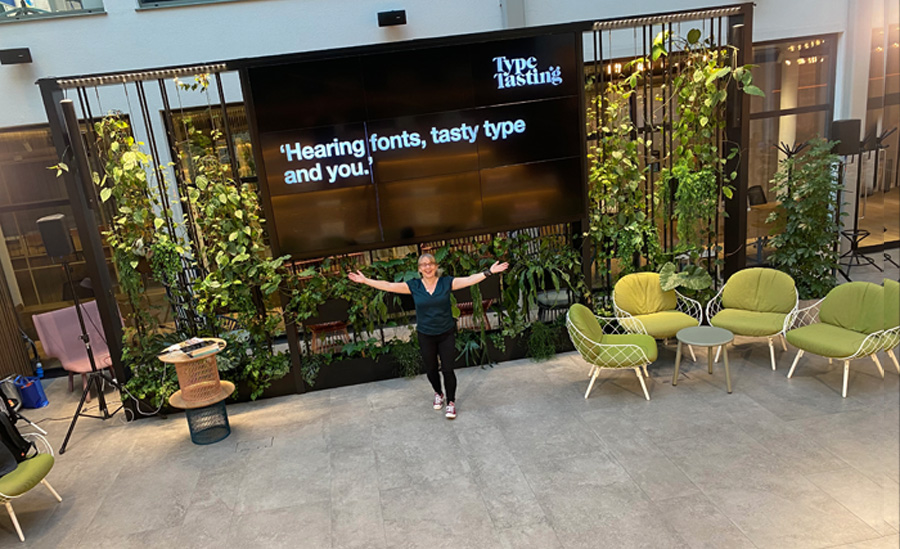
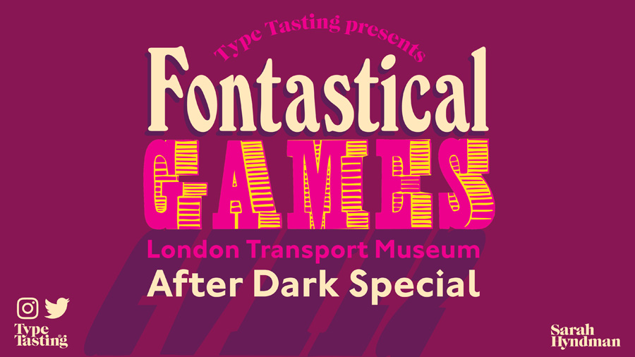
Recently I spoke at the incredibly inspiring TBD evening at Fora (you can see how happy I was to be there). Tonight I’ll be live at the London Transport Museum for a fun evening of Fontastical Games as part of their After Dark series. This will be part gameshow and part quiz. It’s heavily influenced by my love of 1970s gameshows full of laughter and things that will inevitably go wrong.
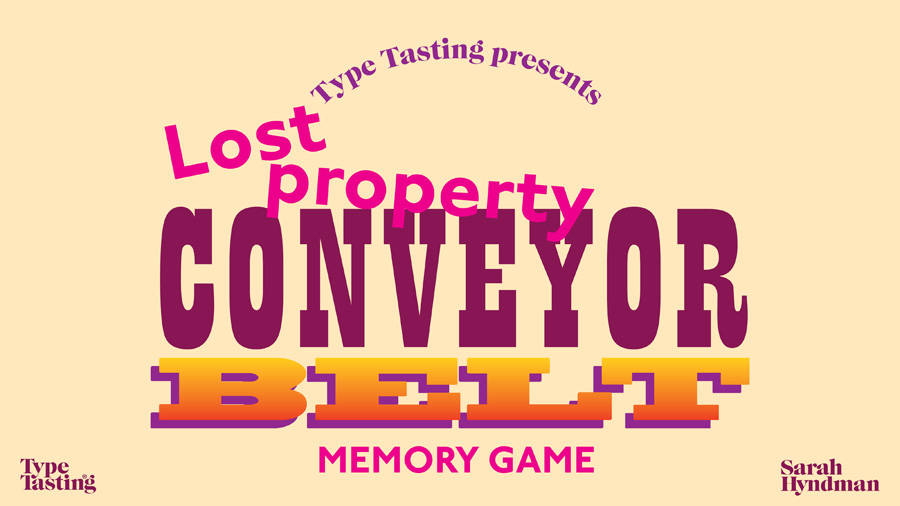
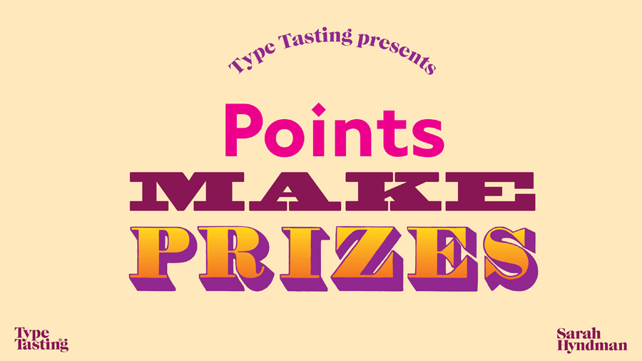
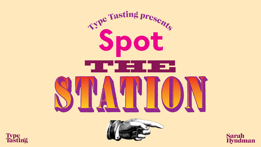
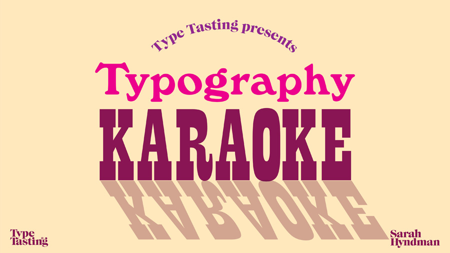
Roll up roll up for an evening of fonts, letters and signs. Can you guess the tube station from the font clues? Will you spot the real sign from the fake? Shout along with typography karaoke. Play along with font charades. And we’ll end with the classic lost property conveyor belt game.
You’ll have the chance to win spot prizes of my books and a set of Hidden London virtual tour tickets.
Friday 12th November Fontastical Games at the London Transport Museum After Dark 6.30–9pm, £10/£12 Come along and join me
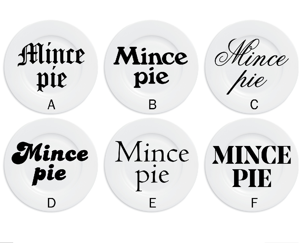
Sanjay Mitra @shonlerock “Would eat a) traditional looking font, Dickensian, fruity, icing sugar. c) trad. appeal, . d) no, looks fun, 70s, but don’t get feeling of quality, little filling. f) could go either way: cheap rubbish, or potentially high quality, large and deep filled. b and e no opinion.”
The Bookwise Owl @BookwiseOwl “E. It’s unfussy and no-nonsense, much like mince pies!”
Claire @ClaireFPalmer (via Twitter) “C Festive and full of posh booze”
Allyn @AllynGR “E: It looks like it’s going to taste traditional but with a modern twist, perhaps stripped down to key flavours, or an interesting new one. I guess because the font is thin it looks like the pie is not going to be too stodgy. The other fonts all looked either to fat or too fussy”


Sanjay Mitra @shonlerock
“Would eat a) traditional looking font, Dickensian, fruity, icing sugar. c) trad. appeal, . d) no, looks fun, 70s, but don’t get feeling of quality, little filling. f) could go either way: cheap rubbish, or potentially high quality, large and deep filled. b and e no opinion.”