Which mince pie would you eat? Which one wouldn’t you eat?
What would they taste like?
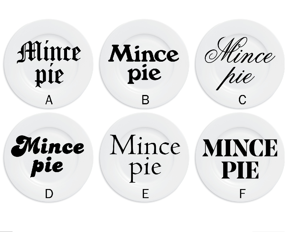
The Bookwise Owl @BookwiseOwl
“E. It’s unfussy and no-nonsense, much like mince pies!”
Claire @ClaireFPalmer (via Twitter)
“C Festive and full of posh booze”
Allyn @AllynGR
“E: It looks like it’s going to taste traditional but with a modern twist, perhaps stripped down to key flavours, or an interesting new one. I guess because the font is thin it looks like the pie is not going to be too stodgy. The other fonts all looked either to fat or too fussy”

Sanjay Mitra @shonlerock
“Would eat a) traditional looking font, Dickensian, fruity, icing sugar. c) trad. appeal, . d) no, looks fun, 70s, but don’t get feeling of quality, little filling. f) could go either way: cheap rubbish, or potentially high quality, large and deep filled. b and e no opinion.”