
I was the guest host for the Design Museum’s #FontSunday on Twitter yesterday which was an amazing experience. I picked the Type Dating Game inspired theme of ‘Fanciable Fonts’ and you all tweeted in your photos of the typefaces you would date (or ditch), along with witty observations and a bad typographic chatup line or two. Thank you to everybody, we even trended on Twitter above Kanye for a few hours, well done!
In the poetic words of Nicole @typographHer “Which typefaces turn you on? Do you find serifs seductive? Or does sans stimulate and excite you? Which fonts do you fancy? I certainly wouldn’t kick @DaltonMaag’s King Caslon out of bed—this ampersand is pure delight! Thankfully typography polygamy is encouraged.”
Here are a few of your fanciable fonts…
EPIC


@tomjohn001″Love is all around. Robert Indiana Love Sculpture”
@deptofdev “Robert Indiana, making love (early 70s).”
@Patrick_Myles ‘Kiss’ by Alan Kitching”


@isetta_windsor “#valentines #fanciable #fonts from @CartersFair #Maidenhead”
@isetta_windsor “those #Danes get straight to the point…”
@tomjohn001″I Love New York logo by Milton Glaser ”
@Patrick_Myles “Kooples Black #FontSunday #Valentine #type”
@nikki_vz “and if you’re looking for a good time, bell centennial FTW. those curves!”


@tonyplcc “Groovy, fab, far out, like exit man (way out) ”
@ACreativeMusing “Something a little #Saucy from me #Pump#Valentine@wallpapermag”
@JAStokesNJ “Murder Madness by M Leinster 1949 – fonts like bones, yep DATE it all night!”
@AnneQuinton “Some fonts are just after one thing”
@loraba “Typewriters and library cards = love”
@loraba “I read the spine and thought that too, but alas… #FontSunday”
HOLIDAY ROMANCE


@JakeTilson “holiday romance in Venice”
@ACreativeMusing “Reminding us all what today’s all about! @houseindustries”
@stevensmith_81 “City of Love. We’ll always have Paris.”
@JakeTilson “Da Fiore in Venice always turns my head. What attitude!”
@HenriHelvetica “We might not date, but an ongoing salacious affair would likely take place, probably in space #NASA”
FLAMBOYANT


@typographHer “I’d love an inky date with any of the fonts in the @stbridelibrary collection for @DesignMuseum ’s #fontsunday”
@typographHer “Head over heels in lust for this #fanciablefont by Jonny Holmes this valentine”
@IMargolius “Can’t be more fancier than this font design”
@uberbabygraphic “I like my lover to be complex: Louis John Pouchée (some at @stbridelibrary!)”
@JAStokesNJ “That red W is awesome. Dating in 1911.”
TIMELESS


@typographHer Bembo & a glass of malbec sounds like a great valentines date to me!”
@IndentDesign “Garamond is a bit of a dandy”
@tonyplcc”If you are going to date a letter these guys are well groomed”
@CoffeeDonatus “I love Buno’s Latin grammar (Gdańsk, 1651).”
@tonyplcc “First edition”
@DavidWolske “Elegant & fine & romantic by design, Paganini Italic, be my Valentine.”
CONFIDENT SLAB SERIFS


@typographHer “Italian Caslon is an awkward date – great personality – but not attractive”
@uberbabygraphic “MARRY: in it for the long haul with Clarendon… solid, dependable, timeless”
@luketonge “I’m partial to Maelstrom by @klimtypefoundry – such contrast, so slab.”
CURVACEOUS


@uberbabygraphic “Bodoni by Giambattista Bodoni late 1780s”
@jofernihough “Worthe numerals, fun and fabulous perfect date”
@GoodBrave “Bella. Because I love a classic curvy figure. ”
CURVACEOUS AMPERSANDS


@PWCFreelance”Love a curvaceous ampersand.”
@ACreativeMusing “Love & Kisses for #Valentine@lubalincenter”
@jubaloo_ “I’d definitely date the Pistilli Roman ampersand designed by John Pistilli.”
@nicoletta_bel “Herb Lubalin’s #ampersand”
LIGATURES


@tonyplcc “The ampersand – letters E and T joined in holy matrimony”
@typographHer “Feijoa is made for hooking up with these ligatures! Delicious& definitely datable”
@tonyplcc “Rosmarie Tissi – the most beautiful joining of serif and sans serif”
@nikki_vz “mrs eaves of course. those g ligatures #swoon”
@ACreativeMusing “The #Curviest letter in the #Alphabet paired up and ready for #Love”
@MCreativeJ”It’s all about the #ampersand!”
MINIMALIST


![]()


@#Chanel works so simply.”
@uberbabygraphic “‘Type Tart’ cards: lots of lusty fun! Here’s Kabel by Rudolf Koch 1927” @sdcdiplomaart “Futura or helvetica…can’t make my mind up!?”
@EmmaOToole2 “Just all promises… forward thinking FUTURA.”
@AnneQuinton “So not Gothic @TypeTasting
@thinkstudionyc “Any proposals today? Design by Herb Lubalin, 1965.”
@IndentDesign”follows a promiscuous selection of fancies and lost loves ”
@tonyplcc “Jeans vs Dinner Jacket?”
@AnneQuinton I’ll forgive M&S”
DATING OBSERVATIONS


@JakeTilson “The equivalent of speed dating for designers … Suitcase Fusion”
@JakeTilson “Is this the equivalent of Tinder for Typographers?”
@tonyplcc “Awful chat up lines: the vowels have put u and i together”
@JakeTilson “a more reliable Typeface dating service”
@JakeTilson “somewhere to try out a few chat up lines – ExCel trade show”
IN THE DETAIL


@isetta_windsor “#valentines #fanciable #fonts from @goldfrapp @MuteUK #postcard”
@Mondegro “We’re in love with the type selection for this 1923 edition.”
SCRIPT


@typographHer Super Smooth Australis Pro Italic bulges in all the right places!”
@tonyplcc “Françoise and John Clemes by Peter Gill”
@typographHer FFDora Display is strong & knows how to have a good time! Definitely a #fanciablefont”
@abonnebonnevie “the fanciable ‘thrilling cities’ font & flirty book cover”
LETTERING


@MHD_Studio “First Time Ever” Beautiful #type by Seb Lester”
@3_esse”Tagging, done the olden way : lush and fanciful lettering by JorisPut.”
@MHD_Studio “Stunning #typography by Si Scott”
@tomjohn001 “Ian Fleming’s illustrated Bond jackets by Michael Gillette”
@thinkstudionyc “Hand-drawn Love Against Hate by Paul Rand, 1942.”
@Frauhaus “we all lovehearts #etching”
@jubaloo_“Loving @PauloBarnesi’s lettering of Love.”
HAIRLINE SERIFS


@CreweCitizen “#Valentines#Type 1936″
@Frauhaus “Powerful and cultured, oh yes…”
EDGY


@tomjohn001 “Seduction by Marian Bantjes for Pentagram”
@uberbabygraphic “Seem to have an ongoing flirtation with Blackletter now. My new infatuation.”
ART DECO


@ladiebirdy77 “the symplicity, the curves, very pleasung to the eye”
@MCreativeJ “Love these numerals!”
@MCreativeJ “Anything in an #ArtDeco typeface, I absolutely adore!”
UNREQUITED

@JakeTilson “Are ghost signs just playing hard to get, or are they shy?”
@ghostsigns “They regularly expose themselves and hang around on street corners, but I’m yet to get one home ;-)”
ORGY?

@Frauhaus “Why choose?”
DITCH


@Cove17 “Going to ditch this creeper for #FontSunday.”
@KathuriaG “So where is the way out?”
@JAStokesNJ “The World Makers by J Maxwell 1969, boring font, DITCH for something better”
FRIENDS


@jofernihough “Strong,masculine & famous – totally datable but in reality a bit meh…”
@AnneQuinton “Some old fonts just can’t seem to keep up with modern ways”
@luketonge “The @friendsoftype aren’t looking for anything serious… ”
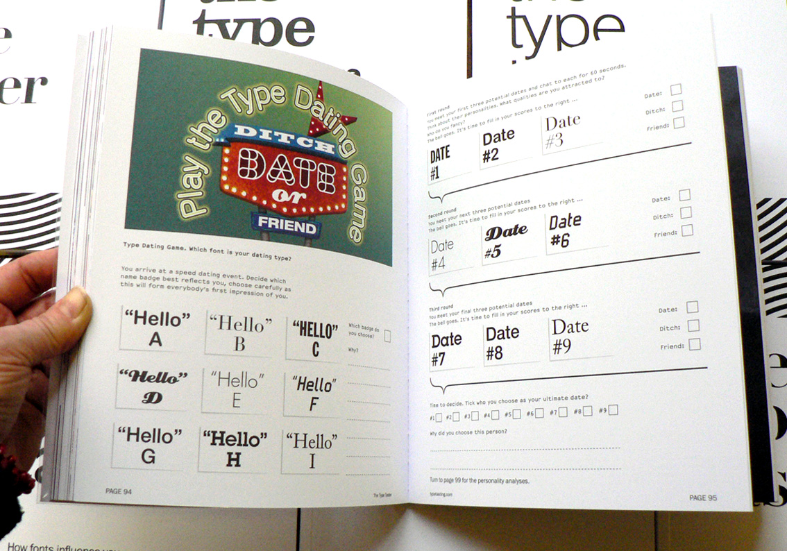
WHY FONTS MATTER
Sarah Hyndman’s book Why Fonts Matter is published by Virgin Books (Penguin/Random House) is available now.


