By Sarah Hyndman
Find out how typography gave the angst and rebellion of Punk a voice, and how you can use fonts to ensure that YOUR message is heard.
Punk changed graphic design¹. When it first exploded in the 1970s it appeared to be youthful rebellion. However, looking back we now consider it to be an important part of the Postmodernist movement, which began as a reaction to the rigid restrictions of Modernism. Punk’s DIY ethos encapsulated the anti-establishment mood of the mid 1970s: a time of ongoing economic hardship, with social fragmentation, an economy struggling to recover from a stock market crash, housing problems and increasing unemployment. This was a decade facing a clash of expectations as both the economy and society struggled to cope with the pace of change as the rose-tinted nostalgia of the past collided with a seemingly out-of-control vision of the future. Sound familiar?
Punk was an empowering time of do-it-yourself, when the message truly became the medium as everybody took up their scissors and glue to create zines, posters, flyers and record sleeves (this was pre-Mac). These were often mass produced on the photocopier in the local library and stapled together by hand—not designed and typeset by professionals. What made Punk’s voice stand out was its difference; it literally broke all the typesetting rules by cutting up the grid and throwing the words back down on the page in a haphazard chaos of styles.
Do you have a message that you want the World to listen to? It’s not just what you say, it’s also the way you say it that will create maximum impact and ensure that your message is heard. Context is key. In 2008 Obama’s presidential ‘Change’ campaign² looked so different to the political typographic landscape in the US at the time, that it literally embodied the theme of change. It did this while also conveying trust, confidence and experience, not idealistic rhetoric.
Craig Oldham documents the miners’ strikes of the 1980s “a historical movement of the working class people”. He shows how the placards distributed by the LCDTU trade union use distinct geometric forms that are “bold and direct in the sea of visual noise that is a mass demonstration”. These letterforms mirror the immediacy and anger of the miners’ hand-written placards, and they also give the miners a unified voice³.
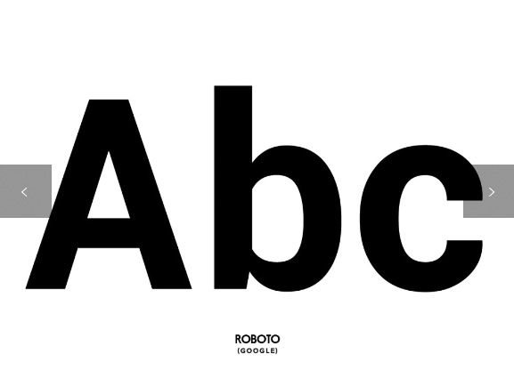
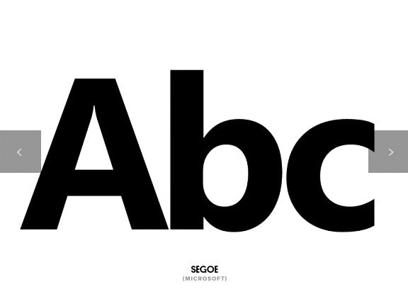
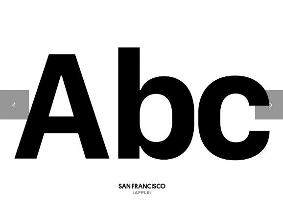
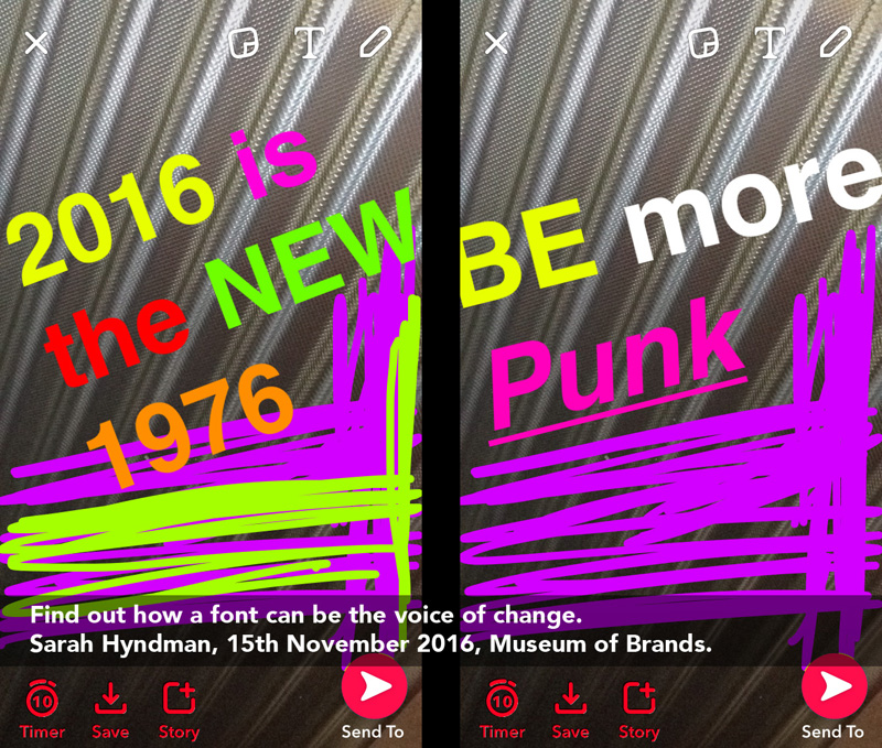
The typography of social media and apps today is of corporate and minimalist sans serif typefaces* that, to the untrained eye, look very similar to each other (above), all contained within a structured grid. There are few opportunities to use type expressively, hence the rise of the emoji. Snapchat is a platform that enables you to customise your words (in any font you want, provided it’s Avenir), and their fleeting 10-second life span encourages a DIY approach that breaks them out of the homogeneity of the social networks.
A typeface gives your cause or movement a recognisable voice that inspires ideas, ensures your message is heard, and empowers your words to make a difference. Looking at the voices of change and rebellion in the context of history reveals the full impact they had at the time, and demonstrates how you can use a font as a catalyst for change.
Would you like to find out more?
Sarah is giving a talk on the subject on 15th November at the Museum of Brands, London.
How to start a revolution with Comic Sans Dazed & Confused magazine interview
Punk was the anti-Helvetica Design Week interview
How Punk changed Graphic Design Sarah Hyndman

Images designed in Snapchat.
References
1. How Punk changed graphic design by Sarah Hyndman
2. Gotham typeface used for Obama’s 2008 presidential campaign
3. In Loving Memory of Work by Craig Oldham
* Wired magazine on the typefaces used by Apple, Google and Microsoft
