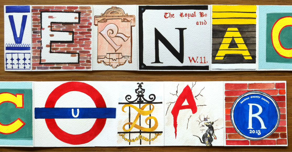
‘Vernacular’ by Anoopa John
“I chose the word ‘Vernacular’ to describe London as I felt that this city has many nuances that are its own. Although it is a city inhabited by people from different countries from around the world, you will always encounter something that is peculiarly London. It could be the architecture, the food, the Cockney slang or the alternative-culture of Camden.”
“But for me, probably because I am a graphic designer and because this particular thing struck me quite strongly when I was living in London, it was the distinctive typographic signs around the city. They were from different time-periods and of different styles. There is no way that you can be in London without being bombarded by these signs. Especially, some of the way-finding signs that are so integral to London and its identity.
“Type Tasting was a fantastic opportunity to show how I saw London through its infinite road signs, tube signs, painted signs, metal signs, billboards and graffitis. These became the inspiration for creating ‘Vernacular’.
“I took V from the Victoria Underground Station sign. E from an old wall-painted sign of Lovell’s Wharf in Greenwich. R from a 1890s Mount Street sign. N from a street sign for Notting Hill Gate which belongs to The Royal Borough of Kensington and Chelsea. A from the ‘Mind the Gap’ signs on the platform of the London Tube Stations. C from the unmistakable Camden Lock sign on Chalk Farm Road in Camden Town.
“The Roundel from the Underground sign was the first thing that came to mind for U. Even though it was too easy, its form is so iconic and characteristic of London!”

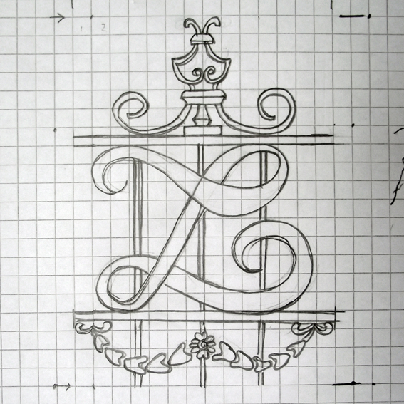
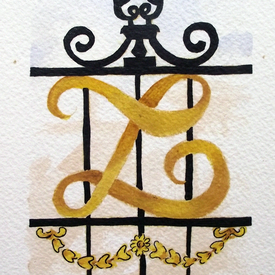
“Metal grills and gates from older buildings in London have an insignia of some form on it. The particular one I chose, reminded me of the gates of the Buckingham Palace and I re-drew the insignia for the letter L. The second A is from Banksy’s graffiti, If Graffiti Changed Anything – It Would Be Illegal, from a wall in Clipstone Street, Fitzrovia. I intentionally placed the ornate L next to the A with its anti-establishment sentiments. It is just amazing how London is able to accommodate such diametrically opposite voices within it.
“Finally, a blue plaque for R. It is commemorative and iconic. They always reminded me that I was living in a city where some of the world’s finest men and women once lived.
Anoopa John is a designer at The Brand Union in Bangalore, India. She describes herself as “a designer with an inexplicable love for typography, good writing, economics, science fiction, traveling and breakfast. Currently, I spend my day as designer at a brand design consultancy called The Brand Union. When I am not working, I can found be with an ipad or a book scribbling, doodling, reading or tweeting.”
Twitter: @anoopajohn

‘Vernacular’ by Anoopa John is one of the words that will be displayed at Type Tasting with the London Design Festival 2013 at the V&A.
Display: 14 – 19 September 2013
Drop in workshops: 10am – 5pm, 14 & 15 September 2013
London Design Festival Hub
Design Studio, Sackler Centre
V&A
Cromwell Road
London SW7 2RL

Type Tasting workshops and type safaris. Typography training with a creative twist.
