Font of Coincidence
This is a story of my trip to teach in India. While I was there I met up with family of friends and discovered, to my surprise, that my book cover had been redesigned by a whole class of students for their typography exam that week.
“The task for our exam was to design the cover for a book called Why Fonts Matter using typography. As I started scribbling out my roughs I thought about what typography is and what it can achieve; every font is different and makes you feel a distinct emotion or connects with you in a certain way.”
Words by Siya Archik, a second year graphic design student in Mumbai.
I have been studying design for two years and my course is different, unique, insanely creative and fun. But along with the fun comes a lot of hard work; hours and days of work created by hand. We put a great deal of thought into every idea that we execute—to make the final product as attractive and innovative as possible. I chose this course of study because creativity has no boundaries; it is something that lets you express your thoughts and emotions in infinitely creative ways and on any surface.
In our course we study calligraphy & typography; anatomy; packaging, information design and communication design. Each is distinctive in its own way, but all revolve around the same design principles. For the first two years we do everything by hand—from rendering large posters to reproducing the text in a newspaper at actual size, carefully hand-drawing every letter so it is perfect.

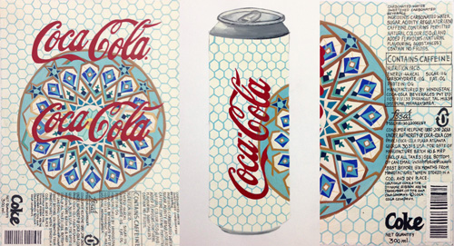
Design for a Coca Cola can by Siya Archik.
Our typography assignments vary from kinetic typography to expressive typography and logo design. We research artists who have helped to expand the field of typography to increase our knowledge, and each assignment emphasises the importance of different fonts in our designs, without which they would mean nothing.
I think typography is important because it is required for anything and everything related to design. From creating logos to packaging, all require knowledge of different fonts and how to use them effectively, so as to make our designs stand out from the rest. This makes typography such an integral part of what we do as designers.
During our recent exam week a friend of my family in England, a typographer from London called Sarah Hyndman, came to visit as a guest lecturer at another design college in Mumbai. I was hoping to meet and talk to her about typography but was not sure whether I would have time because I was so busy taking exams.
One of these exams was in typography: we were given five hours to create a typographic design for a book cover, rendering the visual elements and lettering by hand. When I opened the exam paper and read the instructions ‘Design a book cover for Why Fonts Matter by Sarah Hyndman’ I stared at the paper recognising the name, wondering whether it was the same person and thinking ‘wow what a coincidence!’ when I realised that it was.
Our course tutor, Manasi Keni, explained, “I was looking for an interesting book about Typography to set as the paper for the examination. I searched on Google for ‘best typography books’ and came across Why Fonts Matter. The name of the book poses a casual question but targets a serious issue, giving the students a lot of scope to design it effectively in the given time of 5 hours with only hand work and no computer.” It turns out it was by pure chance that Sarah was in Mumbai and that my family know her.
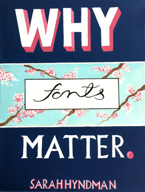
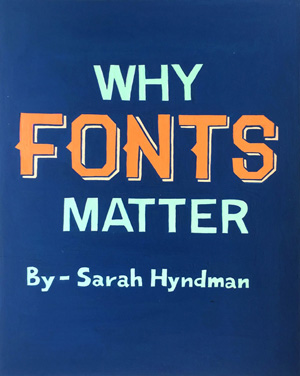
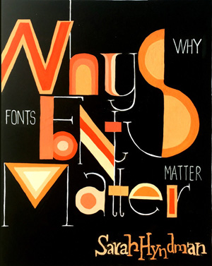
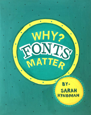
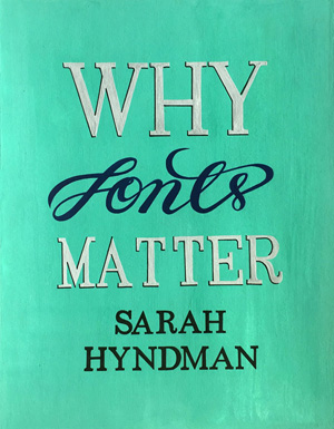
The task in the exam was to design the cover of the book using typography effectively. As I started scribbling out my roughs I thought about what typography is and what it can achieve; every font is different and makes you feel a distinct emotion or connects with you in a certain way. I decided the three main words WHY, FONTS and MATTER should be written in three individual fonts, but they should not be so dissimilar to break up the flow of the design.
I divided the page in 3 parts, one for each word. I chose a 3D font for WHY, the font Albertus for MATTER. I wanted a different feeling altogether for FONTS, so I drew a smaller rectangle inside the bigger one, and in the remaining space showed the blue sky and cherry blossoms and wrote FONTS in freehand, flowing script. The freehand script reminds me of nature, freedom and wanderlust as a whole. The colour scheme was also important and after a lot of trial and error I decided on Navy blue, a shade of pink and white. I thought that the combination of these three colours looked pretty and would be pretty eye-catching on a bookshelf.
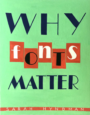
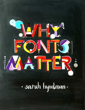
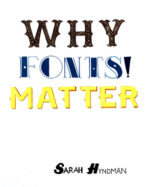
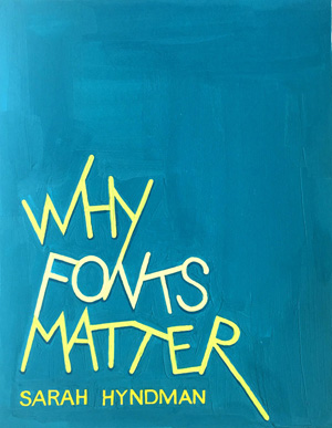
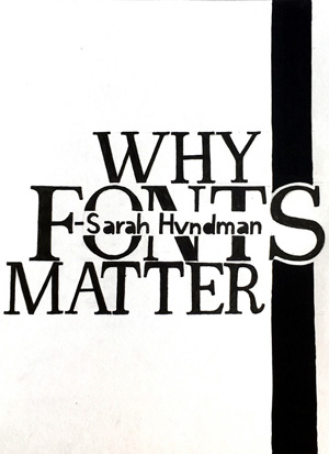
I asked my fellow student Sharvari Marathe to describe the rationale behind her cover design. She told me that “thick or thin, bold or faint, fonts speak volumes about one’s personality and state of mind.” She considered that “the title itself poses a thought-provoking question—how do fonts matter? There are a million existing fonts. Each font has its own unique identity and an emotion behind it.” To express this idea she used a different typeface for each letter of the word ‘fonts’ and balanced out the negative and positive elements of the design. She considers this assignment has helped her to “evolve her understand of typography”.
I was excited to actually meet Sarah and to discus the exam paper with her, because it was such a great opportunity to learn and discuss typography. She told me about her workshops and what she taught the students while she was here in Mumbai. I was really fascinated by her way of teaching typography, which sounds really interesting and innovative. One of her exercises (which I really liked) included sniffing a particular food substance and associating its smell with a font, another involved responding to sounds and drawing them. Sarah’s approach to teaching typography is something I had never heard of before, and it sounds like so much fun. I have asked her if she can come and teach at my college since it seems like such a great learning experience, and I really hope that works out.
Typography is one of my favourite subjects and the conversation I had with Sarah really broadened my horizons and made me even more interested in typography.
Siya Archik is a second year student on the B.F.A Applied Art course at the Rachana Sansad College of Applied Art & Craft, Mumbai India (www.rachanasansad.edu.in). The course tutor is Manasi Keni.
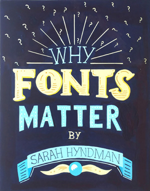
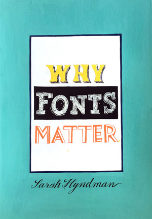
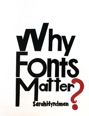
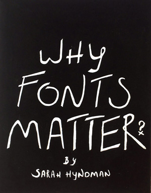

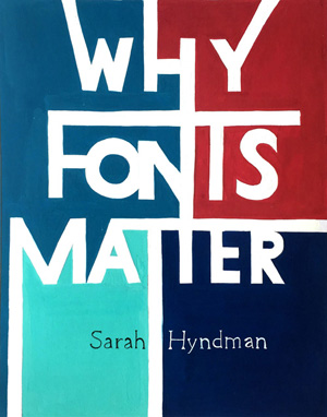
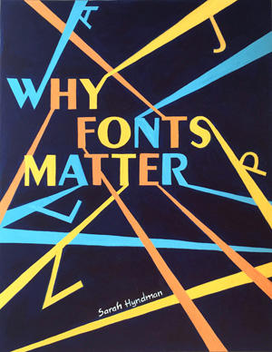
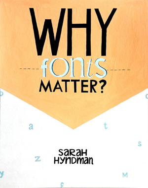
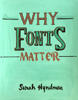
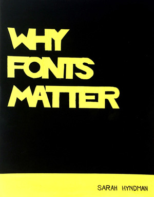
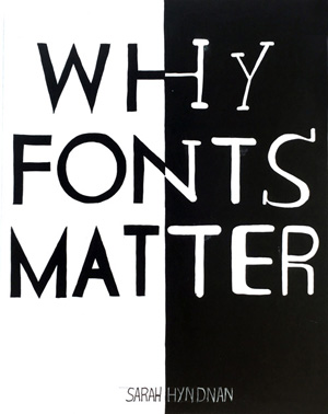
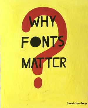
Covers shown at the beginning of the piece are by Siya Archik, Tejusvin Shashital and Prajakta Koshe.
Row 1: Shah Vishwa, Dhrumi Shah, Nupoor Godse, Aishwarya Vernekar. Row 2: Rukhsar Sayed, Akanksha Parulekar, Anagha Pednekar, Aparna Sawant. Row 3: Isha Samel, Tejusvin Shashital, Kinnari Shah, Chitalia Devanshi. Row 4: Shankar Kuhu, Dhwani Gosalia, Jadhav Archana, Prabhu Kaushik. Row 5: Ankit Gandhi, Manasi Gangurde, Mrunmayee Bagwe, Amol Devkate. Row 6: Shah Nishi, Jadhav Shreyas, Prajakta Koshe, Kinjal Khandelwal. Row 7: Shah Bhavyata, Siya Archik, Bhoir Manali, Aditya Dahiwadkar. Row 8: Advait Jadhav, Akshaya Patil.
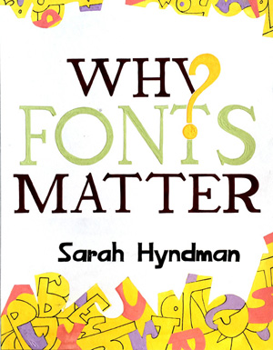
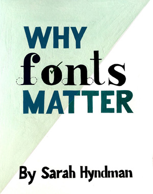
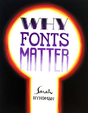
These are the published covers: UK (left) and US (right).
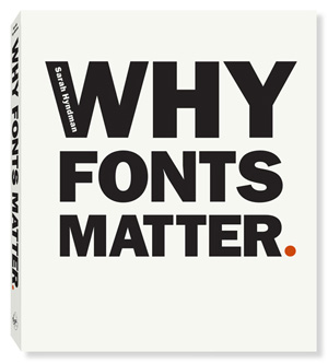

Why Fonts Matter by Sarah Hyndman. Published by Virgin Books (Penguin/Random House), and by Gingko Press in the US.
******************************

“A brilliant, and absolutely crazy journey into typography”
Sarah Hyndman took Type Tasting to the Ecole Intuit Lab, a design college in Mumbai, India, where she spent a week teaching typography to sixty second and third year students. Read about this in the words of the students.
