‘Typeface at the Rock Face’
By Sarah Hyndman
Originally published in Artrocker Magazine issue 134

In our everyday lives we are surrounded by fonts and use them to navigate through our environment, understanding instinctively that they communicate a great deal of the information before we’ve even read the words. We choose typefaces to express our personal style or to demonstrate our allegiance to a philosophy, music style or band.
This is possible because there is such a diversity of font designs which have absorbed a multitude of references and intended messages during their centuries of development. Type we use today is influenced by everything from stone carving, handwritten manuscripts, the evolution of the printing industry and now the plethora of designs available online. When we look at type we don’t just see the words, we also see the letter shapes which—much like fashion or cars—are loaded with associations.
Typefaces absorb layers of references and designers continue to use them in a way that reinforce these to help them communicate their message. We all interpret these meanings readily, often on an instinctive level, and we’ve been learning to do this all our lives.
The associations come from sources including the historical associations we make with a typeface, the physical shapes of the letter forms and most often from the context in which we’ve previously seen a type style used which means that our references are constantly being added to.
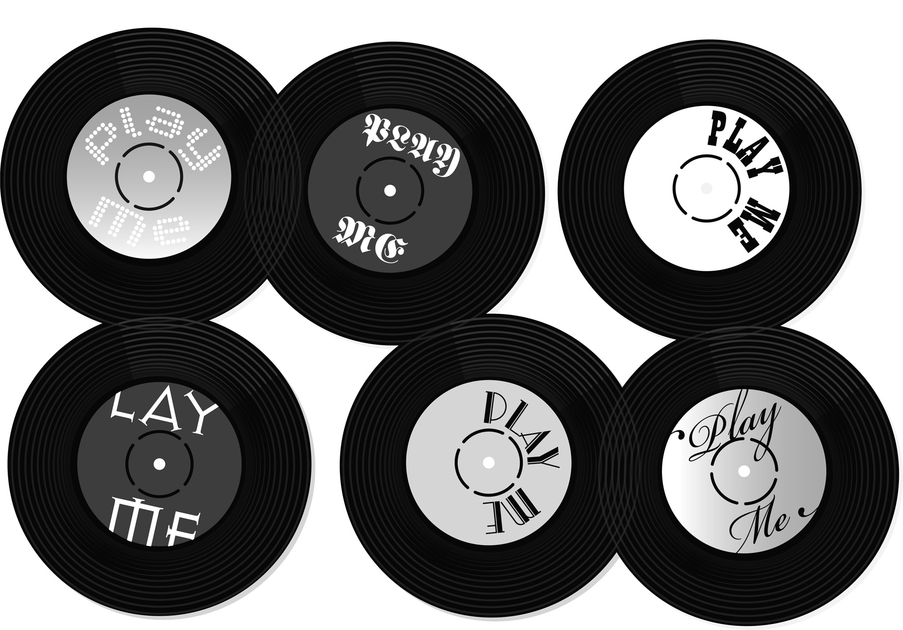
 Music genre quiz
From looking at these record sleeves, which type of music would you expect to hear on each record?
Goth: [ ]
Heavy Metal: [ ]
Love Songs: [ ]
Ambient: [ ]
Country & Western: [ ]
Jazz: [ ]
Answers and explanations at the end.
However, with the exception of Heavy Metal, these typographic stereotypes are most likely to be found on compilation records where the design is intended to sum up an entire music genre. The typography found on records by individual artists/bands is as varied as the artists themselves.
![]() Deconstructed band logos
Deconstructed band logos
Some band logos or album covers achieve iconic status and can be widely seen on t-shirts and products, often out of context of the original music. The logos are so familiar that they can be reduced down to a simple typographic element and still be recogniseable. Which ones do you recognise?
What the font?
Bands choose the type for their logos and record covers for a variety of reasons, here are the stories behind ten iconic examples of type to be found in a record shop. Would the logos have been as iconic if they had made different choices?

![]()
1. Beatles, logo by Ivor Arbiter, 1963
The Beatles logo was apparently sketched in a few moments on a scrap of paper by instrument retailer Ivor Arbiter to clinch a sponsorship deal. The enlarged ‘B’ and ‘T’ are intended to emphasise the word ‘Beat’. The logo was then painted onto the sponsored drum kit by a local sign writer and the rest is history.
This is a style of typeface which has flared terminals instead of traditional serifs. These show the sign painted origins of the type, the flared shape is from the sign painter twisting the brush to create the corner. As a result these fonts are widely used in instances where they would have originally been sign painted such as London road signs, everyday supermarket products and a remarkably high proportion of fried chicken shop signs.

 2. The Doors, logo designed 1967
The outlined double ‘o’s could be windows into the ‘Doors of Perception’ (this is the Aldus Huxley book from which their name was take from), and they also look like pills. The typeface used for the word ‘doors’ is a contemporary looking geometric style. This style was originally influenced by Herbert Bayer’s Universal Alphabet experiments at the Bauhaus in the 1920s, in which he explored reducing the alphabet down to simple geometric shapes.
Despite the timelessness of the main typeface there is a reference to the band’s psychedelic origins in the lettering of the ‘THE’. The Psychedelic Art Movement of the 1960s used visual motifs which included Art Nouveau-inspired curvilinear shapes, hand-drawn type, and intense optical colour vibration inspired by the Pop Art movement.
 3. Yes, logo by Roger Dean, 1972
The logo for progressive rock band Yes is created by artist Roger Dean who carved out a reputation for fantastical, colour-drenched landscapes. Dean’s work is very much in the style of the era and well suited to the band’s symphonic style and their use of mystical and cosmic lyrics. It incorporates influences from the Psychedelic and Art Nouveau Art Movements which can be seen in the hand painted, swirly, decorative type of the era. Dean designed many of the band’s album covers and stage sets.

4. Led Zeppelin, logo by Storm Thorgerson & Aubrey Powell, 1973
Early 1970s typography is influenced by glam and Art Nouveau and the style is linked to fantasy books and films. This can be seen in the Led Zeppelin logo with its Charles Rennie Mackintosh influenced tall, thin lettering and letters within letters. Art Nouveau originated in the 1890s, it embraced architecture through fashion and graphic design with a style inspired by natural forms and curved lines which was applied even to the most utilitarian of objects.
Styles from historic art movements can be found in the typography of more recent albums including Paloma Faith’s ‘Do You Want the Truth or Something Beautiful?’ and the Art Deco lettering on Amy Winehouse’s ‘Back to Black’. In both cases it is appropriate to the style of their music and their early 20th century influences.

 5. Abba, logo by Rune Söderqvist, 1976
This is another logo from the 1970s but in contrast to the curved shapes of psychedelia and Art Nouveau it uses the simple, sans serif typography of Modernist design and corporate logos.
The band’s name is an acronym, comprising the first letters of each of the principal band members’ first names. It is set in News Gothic Bold typeface with the first B inverted so that the two pairs of letters represent each of the two couples in the band facing each other.
Other Sans Serif logos with simple letter rotations include Eminem, Talking Heads and Nine Inch Nails logos.

 6. AC/DC, by Gerard Huerta, 1977
The band chose the name AC/DC to symbolise their energy and the power-driven style of their music. Huerta based the type on writing he’d first seen in the Gutenberg Bible, the first ever printed book. This is a Blackletter style typeface, a printed representation of the handwriting of scribes in manuscripts from the 12th to 15th century.
Blackletter type has been used widely by Heavy Metal bands since the 1970s either for its Medieval/Fantasy associations or for shock value due to Nosferatu films and links with Nazi Germany.

 7. Sex Pistols, logo by Jamie Reid, 1977
Punk was part of the Postmodern movement which began in the 1970s as a reaction to the rigid restrictions of Modernism. Its DIY ethos encapsulated the anti-establishment mood of the mid 1970s, a time of political and social turbulence. At this time the former British Empire was dissolving and a new era in British music, fashion and design was beginning.
The band’s style of music was well represented by art student and anarchist Jamie Reid who had developed his unique collaged ‘ransom note’ typography whilst art directing a radical political magazine. At the time his DIY style was considered shocking and uncontrolled but his influence on design has been far reaching and subsequently widely emulated.

8. Nirvana, logo by Lisa Orth, typesetting by Grant Alden, 1989
Despite its iconic status the Nirvana logo is the complete antithesis of a considered and developed piece of branding. It was designed in the late 1980s when graphic designers needed to commission a typesetter to create the print ready type. The story is that the then unknown Nirvana owed the designer money for previous work. She was reluctant to invest more time and expense and so she asked the typesetter to set the band’s name in the font he had open on his typesetting machine at that very moment. This turned out to be a standard system font called Onyx by Jerry Powell.
Onyx is a condensed fat face display typeface designed to be bold and stand out. Fat face typefaces were first created in the early 1800s to answer the needs of the newly created ‘advertising’ industry. The Industrial Revolution enabled the manufacture of products on a large scale, and since production now exceeded demand the excess could be advertised and sold. The text fonts designed to be read in a book were too delicate to stand out on posters and billboards and so Display Types were designed to shout out their messages.

9. Pulp, ‘We Love Life by Peter Saville, 2001
Pulp’s 2001 album ‘We love Life’ features the band’s name is in Victorian Ornamented Display Type designed by Louis Jean Pouchée in the 1830s. Its use on the album demonstrates well the recent revival in appreciation of traditional printing techniques such as letterpress.
The aesthetics of the Victorian era and their taste for ornamentation had spread to fashion, architecture, interior design and inevitably influenced type design. Louis Jean Pouchée is considered to have taken this to the extreme with what is widely considered to be ‘The Most Ambitious Wood Type in the World’. He took Fat Face Display Types and adorned them with intricately carved images of fruit, agriculture, musical instruments etc. His letters can also be seen reinterpreted by graffiti artist Ben Eine on shop shutters throughout the East End of London, and also feature on Alphabeat’s ‘Fascination’ album cover.
Designer Peter Saville has contrasted Pouchée’s ornate type, which evokes nostalgia and the craft of letter press printing, with instant plastic lettering created on a Dymo label maker.

10. Franz Ferdinand, logo by Paul Thompson, 2004
Franz Ferdinand’s logo and visual style are heavily influenced by Russian Constructivist Movement of the early 20th century. This is a movement that challenged people to participate, it rejected traditional art and started an influential wave of modern art that celebrated the new machine age and embraced angular shapes such as those found in searchlights and projection screens.
This style of design uses Sans Serif type which is taken out of the grid-like structure of formal typesetting. Instead it is placed at angles and combined with bright colours, simple colour schemes and bold, angular shapes to create dynamic compositions. The influence of Russian Constructivism can also be seen on Kraftwerk and Kasabian records.
In summary…
Record sleeve type is not about representing the sound qualities of the music but instead it offers additional information about the band and their ideology. The typefaces used are often either linked to fashions in type (for example the popularity of Art Nouveau inspired typefaces in the early 1970s) or communicating a message (such as referencing an art movement or using type and imagery for shock value). A few logos or album covers reach iconic status which can, in some instances, transcend the original music. For example how many of the wearers of Ramones t-shirts today do you think have listened to one of their albums or been to a Ramones gig?
Music genre quiz answers
Goth [D]: Letters with shapes that suggest Occult symbolism.
Heavy Metal [A]: This is a music genre that often uses Blackletter type either for its fantasy associations and links to Vampire films, or for the shock value of its associations with Nazi Germany.
Love Songs [E]: Decorative Script lettering is associated with greetings cards, chocolates and engraving.
Ambient [C]: The modern, geometric shaped lettering suggests technology and rhythm.
Country & Western [B]: A classic wanted poster slab serif style font which evokes Americana and the Wild West.
Jazz [F]: The Art Deco type face is in keeping with the era in which Jazz was in its heyday, and also evokes ideas of Speakeasies and decadence.
©Sarah Hyndman
sarah@typetasting.com

Artrocker magazine is an independent monthly publication, concentrating on music and modern culture.
Book a Type Tasting if you would like to find out more…
Virtual Type Safari: Record Shop
Take a virtual tour of the Type Tasting record collection and hear the stories behind the typography on the record sleeves.
(Studio based talk with slides)
Learn Type History via Pop Culture
Journey through our understanding of type via popular culture: from 15th century monks to Punk and beyond.
(Talk + discussion)
Typographic Swearing ‘n’ Cussing
An irreverently social evening creating profanities out of hand drawn DIY type and lettering.
(Social + creative workshop)
Email to book a Type Tasting or arrange a call back.
Type Tasting article on type and record sleeves coming out in Artrocker Magazine 134 November issue.
