
This is a survey that was created a few weeks ago to coincide with the 4th of July. However, current events that continue to unfold here in the UK mean that it is too soon to look for parallels, or to write a witty analysis. Instead this post is to be a celebration of our shared language of type—whatever our beliefs, wherever we live. Typography is a shared language that gives us the freedom to communicate more effectively with the whole World. In London we are linking arms with our neighbours and friends in celebration of our beautifully diverse and dynamic communities. This would not be the wonderful and crazy city it is without the differences that inspire us and we learn so much from. No matter what happens in politics, we will always be both European and citizens of the World, so let’s embrace and celebrate what we have in common as a global family and keep communicating with each other.

In Fonts You Trust?
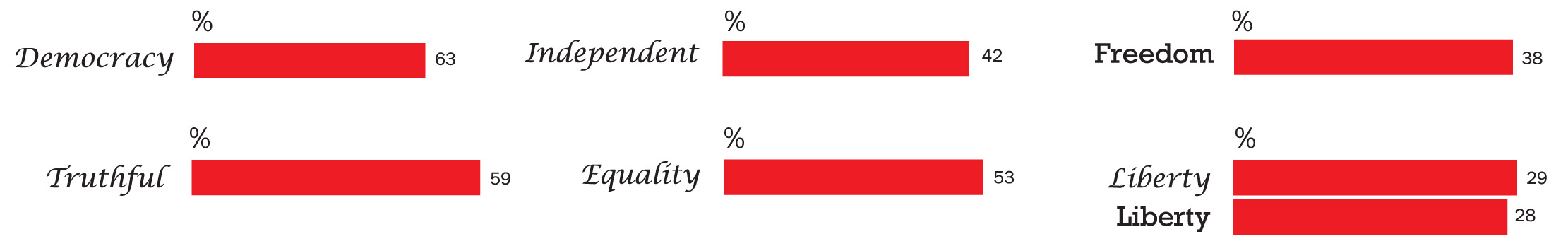
Shown above are the typefaces paired with values taken from the Declaration of Independence by participants of an online survey (1). Here the results of Type Tasting Font Census surveys (2) have been used to create a personality profile of each word, based in the typeface it has been paired with.
Democracy, Truthful and Liberty are shown as sharing qualities of the intellectual and important; that they are considered to be traditional and trustworthy.
Democracy is the most open and confident of the three concepts, as shown by it’s larger lower-case letters. Truthful and Liberty are shown to be considered knowledgeable but a little old fashioned.
Independent is embodied as a confident leader. It has serifs, which root it in tradition, but their solid slab shapes show that (unlike Democracy, Truthful and Liberty) it is distinctly modern and forward-looking. This is the practical style of doers.
Freedom is conveyed as having the qualities of idealists and artists. The flowing, calligraphic shapes demonstrate that it is friendly and dignified, but a performer at heart.
The concept of Equality is represented as modern and an idealist. Its letter forms are confident and neutral and its generous, large shapes convey confidence and leadership.
Democracy is in Georgia. Truthful and Liberty are in Caslon. Independent is in Rockwell. Freedom is in Lucida Calligraphy. Equality is in Avant Garde.
Question: which typefaces BEST match each word?

Question: which are the WORST match for each word?
Typefaces
The typefaces chosen are either designed by iconic US type designers, Caslon is included because it has been used for the Declaration of Independence. All were set to the same cap-height.
Avant Garde by Herb Lubalin & Tom Carnase, 1970-1977.
Caslon by William Caslon I, 1731. (revised version is Adobe Caslon by Carol Twombley).
Franklin Gothic by Morris Fuller Benton, 1902-1967.
Georgia by Matthew Carter, 1993.
Lucida Calligraphy by Charles Bigelow & Kris Holmes, 1985.
Rockwell by Monotype, 1934.
References
(1). Online Type Tasting survey ‘In Fonts You Trust’ http://www.surveymonkey.co.uk/r/usoffonts
(2). Type Tasting Font Census surveys, Why Fonts Matter, 2016, Virgin Books.
Survey statistics
Online Type Tasting ‘In Fonts You Trust?’ survey.
114 participants: 50% in UK, 25% in North America.
60% aged 30 and under.
64% have professional experience with typography.
57% female, 43% male.
40% on a mobile phone or tablet, 60% on laptop or computer.
![]()
![]()
