
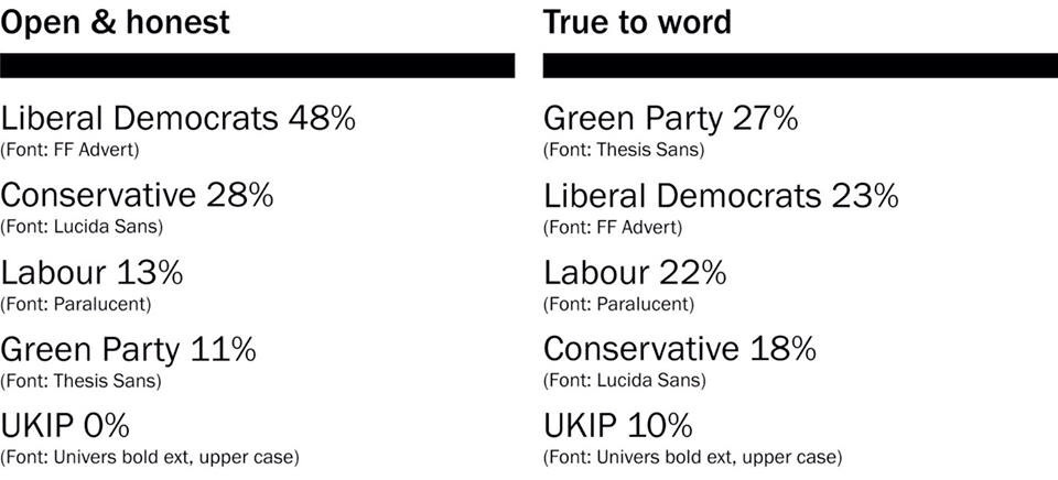
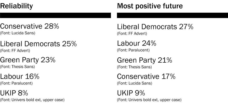
These are the poll results for the online Font Elections survey. Voting is based on the typefaces used in the logos of the five most prominent political parties in the upcoming UK General Elections. The most interesting thing about the responses are the descriptions, participants were not made aware of which font matched each party until the end.

Why people would vote for Thesis Sans (Green Party): “Solid and reliable”, “Most overall balanced”, “Not too grabby or bold”.
Why people would not vote for Univers Bold Extended, stretched (UKIP): “Trying too hard”, “Bit aggressive”, “desperate”, “Angry”, “looks more demanding”.
Why people think Lucida Sans (Conservative) looks most reliable: “Not too fancy”, “Straight forward”, “Heavier weight, makes it appear as though it is reinforcing its own meaning”, “strong, confident look”.
Why FFAdvert (Lib Dem) looks most open & honest: “Clean and clear”, “The roundness of the letters makes it seem sweet and honest”, “Handwriting shaped ‘a'”, “More white space, more open for honesty”.
Why people think Paralucent (Labour) shows a more positive future: “Light and positive”, “The playfull thickness of the crossbars and tails (the u letters)”, “The ‘e’ makes me thinking of a smiling face”.
Polling results shown are from 80 participants, 55% don’t have professional experience with typography, the majority live in the UK and US.
